Python for Data Science: Chapter 3: Foundations of Data Science
Data science process: 4. Exploratory Data Analysis (EDA)
Definition, Reasons to use, Importance, Techniques
Definition, Reasons to use EDA in data science, Importance of EDA, Techniques of EDA: 1. Introduction to Graphical or Visual Techniques 2. Non‒Graphical Techniques: Central tendency, Measures of spread or dispersion, Frequency tables
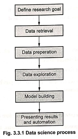
Data science process is a series of
activities that help us move from a business problem to a useful solution based
on data. 1.
Define research goals 2. Data retrieval 3. Data preparation 4. Data exploration
5. Model building 6. Presenting results and automation
4. Exploratory Data Analysis
•
Exploratory data analysis is a power technique to explore and analyse data. It
is a technique that data professionals can use understand a dataset before they
start to model it.
• Definition:
Exploratory data analysis is a process
of exploring, summarizing, visualizing,
and discovering patterns or
relationships in data to get more insight for data.
Reasons to use EDA in data science
•
Following are reasons why we need exploratory data analysis ‒
1) Understanding the datasets : EDA
provides overview of data sets, variables, data types. It also helps to
identify missing values and inconsistencies in the data.
2) Detecting data quality issues:
It helps find missing values, duplicate records and inconsistent data. It
identifies anomalies, such as incorrect data entries and formatting issues.
3) Identifying patterns and
relationships:
It helps discover trends, correlations and associations between different
variables.
4) Detecting outliers and anomalies: It identifies
extreme values that may affect model performance.
5) Improving model performance
: EDA ensures that clean and well‒processed data is used for training, leading
to better model accuracy. It helps avoid biased or misleading conclusions by
detecting issues early.
Importance of EDA
•
Following are the factors that indicate the importance of EDA ‒
1) Data cleaning and data
preparation :
Using
data cleaning and handling missing values, the errors and inconsistencies from
the data can be identified and rectified. Such data is then ready for further
analysis and modelling.
2) Understanding data: EDA helps data
scientists understand the structure and characteristics of the dataset. It
provides a comprehensive view of the data's distribution.
3) Identifying patterns and trends: EDA
allows for the identification of patterns, trends and relationships within the
data.
4) Feature engineering: EDA
can inspire the creation of new features or the transformation of existing
ones. Understanding the relationships between variables can lead to the
creation of more meaningful and predictive features.
5) Shapes the entire data science
workflow:
By
providing a deep understanding of the data, EDA sets the stage for all
subsequent steps in the data science workflow, from model selection and
training to evaluation and interpretation.
Techniques of EDA
•
Exploratory data analysis can be done in two main ways ‒
1.Graphical or Visual techniques :
Using charts and plots the data exploration is done.
2. Non‒graphical techniques:
Using statistical methods and summaries the data exploration and analysis is
done.
1. Introduction to Graphical or Visual Techniques
•
Visual aids are essential tools in Exploratory Data Analysis (EDA) to help
understand, summarize and present data in a clear and meaningful way. Here are
some common visual aids used in EDA:
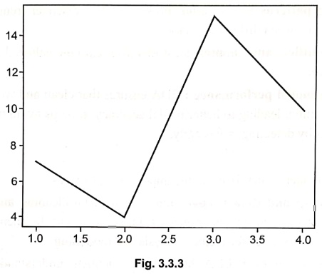
1. Line chart:
A line chart shows data points
connected by lines. It's great for visualizing trends over time. It shows
increase or decrease in the data. For example ‒ Tracking monthly sales of a
product throughout the year.
2.Scatter plot :
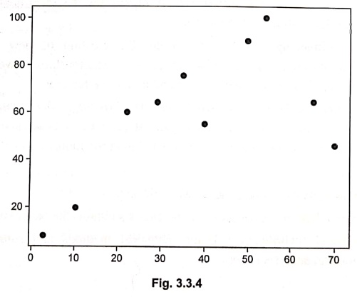
A scatter plot uses dots to represent the relationship between two variables.
It helps to identify correlations.
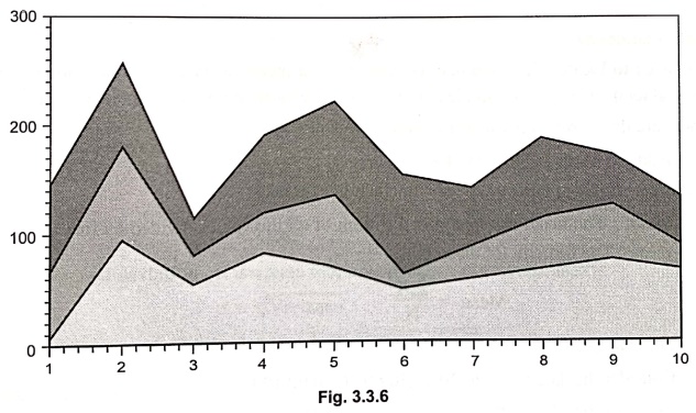
3. Area plot and stacked plot :
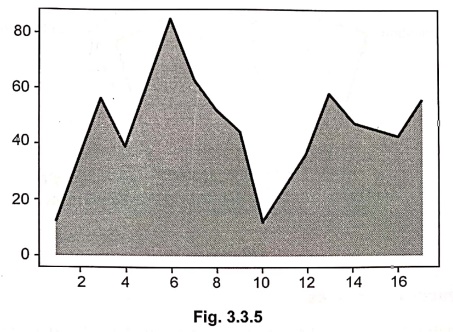
An
area plot is like a line chart but with the area below the line filled in. A
stacked plot shows multiple datasets on top of each other. Example (Area Plot): Showing website traffic over a week.
• Example (Stacked
plot) : Showing contributions from different sources to
total sales.
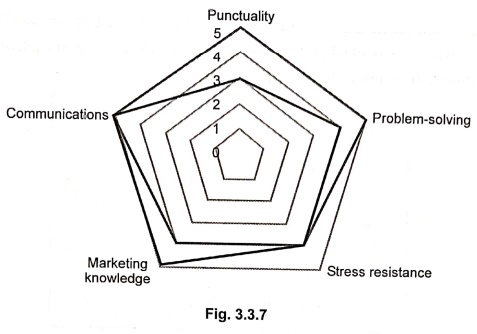
4. Polar chart:
A polar chart (or radar chart) displays multivariate data in a circular format.
It's good for comparing multiple categories. For example Comparing skills of
employees.
2. Non‒Graphical Techniques
•
Non‒graphical methods use numbers and
statistics to describe data instead of plots and graphs. It can be done using central tendency, spread and shape of data distribution.
1. Central tendency
• It is used to locate where the data is
centered, that means it try to find the middle values. Central tendencies give
us an idea of the average or most common values in our data.
• There are three commonly used measures for
central tendency
1)
Mean 2) Median and 3) Mode
• Let us discuss them one by one with the help
of examples
1) Mean :
The mean can be defined as sum of all the values divided by total number of
values. The formula for mean is
Mean
= ∑X / N
For
example ‒
Consider
the data as 10,20,30,40,50,60,70,80,90,100.
Mean
= (10+20+30+40+50+60+70+80+90+100)/10=55
2) Median :
It is basically the middle value when the data is arranged.
For
example ‒
Consider
odd number of elements
5,
10, 15, 20, 25, 30, 35
the
median is 20
Consider
even number of elements
5,
10, 15, 20
the
median is
(10+ 15) / 2 = 12.5
3) Mode:
The mode is the value that occurs
frequently in the dataset. If each element appears only once in the dataset
then there is no mode.
For
example ‒ 1, 2, 3, 5, 5, 5, 6 here the mode is 5
2. Measures of spread or dispersion :
• Dispersion is a technique to describe how
spread out the data is. In other words, the dispersion measures show how much the data varies.
•
Following are types of summaries of
spread
1) Range:
It is the difference between largest and smallest values or difference between
max and min value. For example ‒
Consider
10,20,30,40,50 are the data points then range = max ‒ min = 50–10 = 40
2) Variance:
It represents how far each value is from the mean. The formula is –
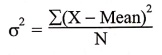
For
example ‒ If data is 5, 10, 15 mean 10
Variance
= [ (5 − 10)2 + (10 − 10)2 + (15 – 10)2 ] / 3
=
[25+0+25] / 3
=
16.67
3) Standard deviation:
It is square root of variance. The formula used is ‒
σ
= √ Variance
If
variance is 16.67 then standard deviation is = √16.67 = 4.08
3. Frequency tables
•
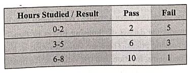
Frequency table shows how often values
often. For example ‒ following is a frequency table for data analysis, that
represents the relationship between two variables –
Python for Data Science: Chapter 3: Foundations of Data Science : Tag: Computer Programming, Python, Data Science : Definition, Reasons to use, Importance, Techniques - Data science process: 4. Exploratory Data Analysis (EDA)
Python for Data Science: Chapter 3: Foundations of Data Science
Under Subject
Python for Data Science
AD25201 2nd Semester AIDS Dept | 2025 Regulation | 2nd Semester 2025 Regulation
Related Subjects

English Essentials II
EN25C02 2nd Semester | 2025 Regulation | 2nd Semester 2025 Regulation

Tamils and Technology தமிழர்களும் தொழில்நுட்பமும்
UC25H02 2nd Semester | 2025 Regulation | 2nd Semester 2025 Regulation

Linear Algebra
MA25C02 2nd Semester | 2025 Regulation

Applied Physics (CSIE) II
PH25C03 2nd Semester AIDS, CSE, IT, CSE(CY) Dept | 2025 Regulation | 2nd Semester 2025 Regulation

Digital Principles and Computer Organization
CS25C06 2nd Semester AIDS, CSE, IT, CSE(CY) Dept | 2025 Regulation | 2nd Semester 2025 Regulation

Basic Electrical and Electronics Engineering
EE25C01 2nd Semester | 2025 Regulation | 2nd Semester 2025 Regulation
Python for Data Science
AD25201 2nd Semester AIDS Dept | 2025 Regulation | 2nd Semester 2025 Regulation

Re-Engineering for Innovation
ME25C05 2nd Semester | 2025 Regulation | 2nd Semester 2025 Regulation
Python for Data Science - Laboratory
AD25201 2nd Semester AIDS Dept | 2025 Regulation | 2nd Semester 2025 Regulation