Python for Data Science: Chapter 4: Descriptive Analytics
Describing Data with Tables and Graphs
1. Frequency Tables 2. Graphs
Describing
Data with Tables and Graphs
1. Frequency Tables
•
When we collect raw data, it is often unorganized and difficult to interprete.
To make the data meaningful, we summerize it by showing how often each value
occurs. This is done using frequency
table.
•
Definition: A frequency table is a
way of organizing data to show how many times(frequency) each value or group of
values occur in dataset.
•
For example ‒ Consider, following
are the marks of students out of 100.
25,
35, 40, 42, 45, 46, 47, 50, 52, 55, 57, 58, 60, 63, 65, 66, 67, 68, 70, 72, 73,
74, 75, 77, 78, 80, 82, 85, 88, 90.
The
frequency table can be prepared for this data and it is as follows –
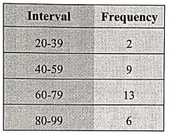
Important observation:
Most students scored between 60‒79 because this has highest frequency.
2. Graphs
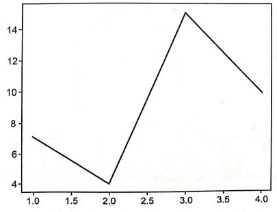
1. Line
chart: A line chart
shows data points connected by lines. It's great for visualizing trends over
time. It shows increase or decrease in the data. For example ‒ Tracking monthly
sales of a product throughout the year.
2. Bar
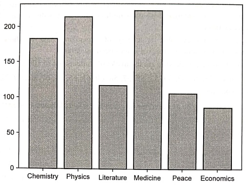
chart:
A bar chart uses rectangular bars to represent data. It's useful for comparing
different categories. For example ‒ Number of students attended different
3.
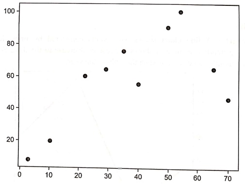
Scatter plot :
A
scatter plot uses dots to represent the relationship between two variables. It
helps to identify correlations.
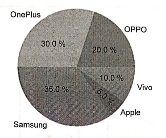
4. Pie
chart:
A pie chart represents data as slices of a pie. Each slice shows a proportion
of the whole. For example ‒ Popularity of various mobile brands can be
represented by using pie chart.
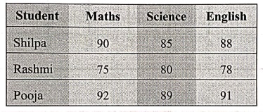
5. Table
chart: A table
chart organizes data into rows and columns. It's useful for precise,
detailed information. For example: Showing student grades.
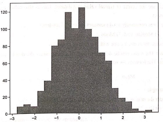
6.
Histogram:
A histogram shows the distribution of a dataset. It
uses bars to represent the frequency of data within certain intervals. For
example: Showing the distribution Indeed e of test scores.
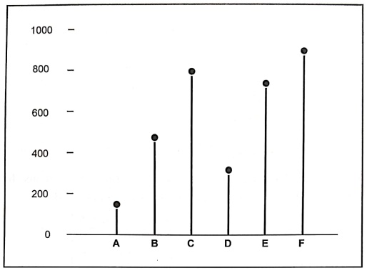
7.
Lollipop chart: A lollipop chart is similar to a bar
chart but with circles at the ends of the bars. It's useful for a cleaner look.
For example ‒ Comparing the heights of different buildings.
Review Question
1.What is the main
purpose of creating a frequency table?
Python for Data Science: Chapter 4: Descriptive Analytics : Tag: Computer Programming, Python, Data Science : - Describing Data with Tables and Graphs
Python for Data Science: Chapter 4: Descriptive Analytics
Under Subject
Python for Data Science
AD25201 2nd Semester AIDS Dept | 2025 Regulation | 2nd Semester 2025 Regulation
Related Subjects

English Essentials II
EN25C02 2nd Semester | 2025 Regulation | 2nd Semester 2025 Regulation

Tamils and Technology தமிழர்களும் தொழில்நுட்பமும்
UC25H02 2nd Semester | 2025 Regulation | 2nd Semester 2025 Regulation
Linear Algebra
MA25C02 2nd Semester | 2025 Regulation

Applied Physics (CSIE) II
PH25C03 2nd Semester AIDS, CSE, IT, CSE(CY) Dept | 2025 Regulation | 2nd Semester 2025 Regulation
Digital Principles and Computer Organization
CS25C06 2nd Semester AIDS, CSE, IT, CSE(CY) Dept | 2025 Regulation | 2nd Semester 2025 Regulation

Basic Electrical and Electronics Engineering
EE25C01 2nd Semester | 2025 Regulation | 2nd Semester 2025 Regulation
Python for Data Science
AD25201 2nd Semester AIDS Dept | 2025 Regulation | 2nd Semester 2025 Regulation

Re-Engineering for Innovation
ME25C05 2nd Semester | 2025 Regulation | 2nd Semester 2025 Regulation
Python for Data Science - Laboratory
AD25201 2nd Semester AIDS Dept | 2025 Regulation | 2nd Semester 2025 Regulation