Python for Data Science: Laboratory Programs in Python
Line plot, bar plot, histogram, and box plot
Laboratory Programs in Python
Python for Data Science: Laboratory Programs in Python: Data Visualization - Matplotlib : Line plot, bar plot, histogram, and box plot
Matplotlib: Python Programming Exercises
Ex 1.
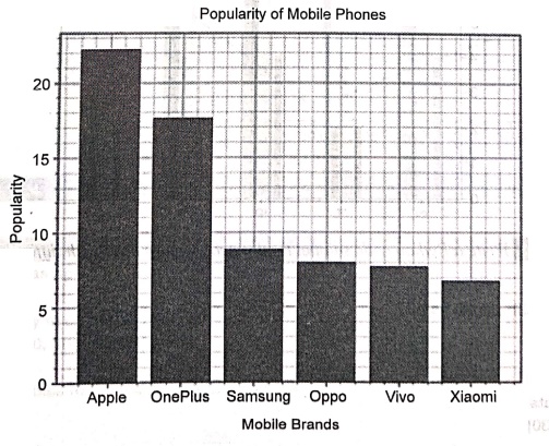
Write a Python programming to display a bar chart of the popularity of mobile phone brands.
Sample data:
Mobile phone brands: Apple, OnePlus, Samsung, OPPO, VIVO, Xiaomi
Popularity: 22.2, 17.6, 8.8, 8, 7.7, 6.7
Solution :
import matplotlib.pyplot as plt
x = ['Apple', 'OnePlus', 'Samsung', 'OPPO', 'ViVo', 'Xiaomi']
popularity = [22.2, 17.6, 8.8, 8, 7.7, 6.7]
x_pos = [i for i, in enumerate(x)]
plt.bar(x_pos, popularity, color='blue')
plt.xlabel("Mobile Brands")
plt.ylabel("Popularity")
plt.title("Popularity of Mobile Phones \n")
plt.xticks(x_pos, x)
# Turn on the grid
plt.minorticks_on()
plt.grid(which='major', linestyle='‒', linewidth='0.5', color='red')
# Customize the minor grid
plt.grid(which='minor', linestyle=':, linewidth='0.5', color='black')
plt.show()
Output
Popularity of Mobile Phones
Ex 2.
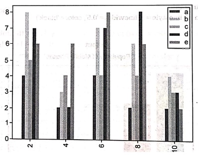
Write a Python code snippet to create bar plot from a DataFrame.
Sample DataFrame:
a b c d e
2 ,4,8,5,7,6
4 2,3,4,2,6
6,4,7,4,7,8
8 2,6,4,8,6
10 2,4,3,3,2
Solution:
import pandas as pd
import matplotlib.pyplot as plt
import numpy as np
a=np.array([[4,8,5,7,6], [2,3,4,2,6],[4,7,4,7,8],[2,6,4,8,6], [2,4,3,3,2]])
df=pd.DataFrame(a, columns=['a', 'b','c','d', 'e'], index=[2,4,6,8,10])
df.plot(kind='bar')
plt.show()
Output
Ex 3.
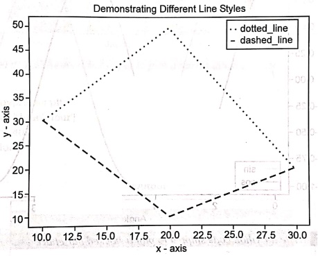
Write a Python code snippet to plot two or more lines with different styles.
Solution :
import matplotlib.pyplot as plt
# line 1 points
x1 = [10,20,30]
y1 = [30,50,20]
# line 2 points
x2 = [10,20,30]
y2 = [30,10,20]
# Set the x axis label of the current axis.
plt.xlabel('x‒axis')
# Set the y axis label of the current axis.
plt.ylabel('y‒axis')
# Plot lines and/or markers to the Axes.
plt.plot(x1,y1, color='green', linewidth = 4, label= 'dotted_line',linestyle='dotted')
plt.plot(x2,y2, color='blue', linewidth 6, label = 'dashed_line', linestyle='dashed')
# Set a title
plt.title("Demonstrating Different Line Styles")
# show a legend on the plot
plt.legend()
# function to show the plot
plt.show()
Output
Demonstrating Different Line Styles
Ex 4.
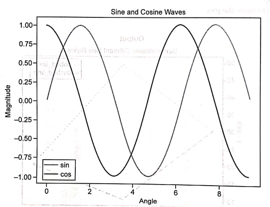
Write a Python code snippet to create sine and cosine wave in the same plot.
Solution :
import matplotlib.pyplot as plt
import numpy as np
# Using Numpy to create an array X
np.arange(0, np.pi*3, 0.1)
# Assign variables to the y axis part of the curve
y = np.sin(x)
z = np.cos(x)
plt.plot(x, y, color='r', label='sin')
plt.plot(x,z, color='b', label='cos')
plt.xlabel("Angle")
plt.ylabel("Magnitude")
plt.title("Sine and Cosine Waves")
# Adding legend, to recognize the curve according to it's color
plt.legend()
plt.show()
Output
Sine and Cosine Waves
Ex 5.
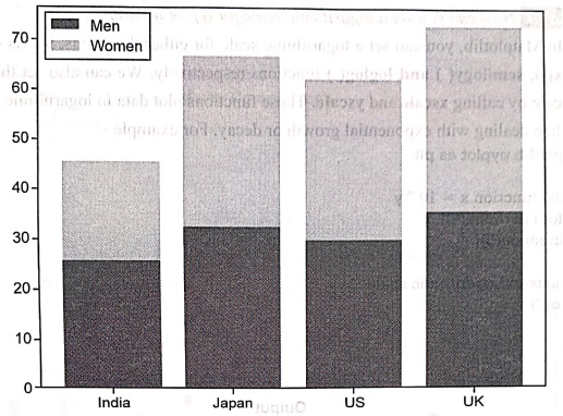
Write a Python code snippet to plot a stacked bar chart.
Solution :
import matplotlib.pyplot as plt
labels = ['India', 'Japan', 'US', 'UK']
men = [25, 32, 30, 35]
women = [20, 35, 32, 38]
plt.bar(labels, men, color='b', label='Men')
plt.bar(labels, women, color='r', bottom=men, label='Women')
plt.legend()uster
plt.show()
Men
Output
Ex 6.
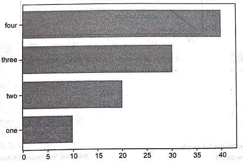
Write a Python code snippet to plot a horizontal bar chart.
Solution :
import matplotlib.pyplot as plt
labels = ['one', 'two', 'three', 'four']
values = [10, 20, 30, 40]
plt.barh(labels, values)
plt.show()
Ex 7.
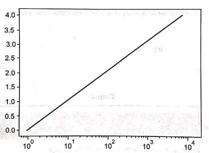
How can you set a logarithmic scale for a plot in Matplotlib?
Solution:
In Matplotlib, you can set a logarithmic scale for either the x‒axis, y‒axis or both using the semilogx(), semilogy() and loglog() functions respectively. We can also set the scale of an axis to log scale by calling xscale and yscale. These functions plot data in logarithmic scales which are useful when dealing with exponential growth or decay. For example ‒
import matplotlib.pyplot as plt
# exponential function x = 10^y
x = [ 10**i for i in range(5)]
y = [i for i in range(5)]
#convert x‒axis to Logarithmic scale
plt.xscale("log")
plt.plot(x,y)
Output
Ex 8.
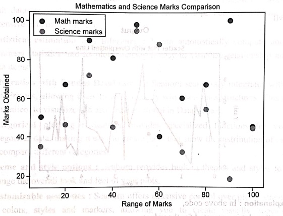
Write a Python program to draw a scatter plot comparing two subject marks of Mathematics and Science. Use marks of 10 students.
Test data:
math_marks = [50, 67, 90, 81, 98, 40, 60, 67, 100, 45]
science_marks = [35, 46, 72, 45, 95, 88, 32, 54, 18, 44]
marks_range=[10, 20, 30, 40, 50, 60, 70, 80, 90, 100]
Solution:
import matplotlib.pyplot as plt
import pandas as pd
math_marks = [50, 67, 90, 81, 98, 40, 60, 67, 100, 45]
science marks = [35, 46, 72, 45, 95, 88, 32, 54, 18, 44]
marks_range = [10, 20, 30, 40, 50, 60, 70, 80, 90, 100]
plt.scatter(marks_range, math_marks, label='Math marks')
plt.scatter(marks_range, science_marks, label='Science marks')
plt.title('Mathematics and Science Marks Comparison')
plt.xlabel('Range of Marks')
plt.ylabel('Marks Obtained')
plt.legend()
plt.show()
Output
Ex 9.
How to overplot a line on scatter plot in Python. Illustrate with code.
Solution :
import matplotlib.pyplot as plt
import numpy as np
# Sample data for scatter plot
x = np.array([1, 2, 3, 4, 5])
y = np.array([2, 3, 4, 5, 3.5])
# Generate random values for line plot
np.random.seed(0) # Set seed for reproducibility
x line = np.random.rand(30) * 5 # Random values between 0 and 5
x_line = np.sort(x_line)
y_line = np.random.rand(30) * 10 # Random values between 0 and 10
plt.scatter(x, y, color="blue')
plt.plot(x_line, y_line, color='red')
plt.xlabel('X axis')
plt.ylabel('Y axis')
plt.title('Scatter Plot with Overplotted Line')
plt.show()
Output
Scatter Plot with Overplotted Line
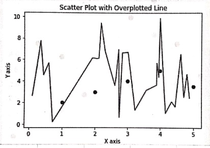
Code explanation: In above code,
• The scatter plot is generated for the values ‒
o x = np.array([1, 2, 3, 4, 5])
o y = np.array([2, 3, 4, 5, 3.5])
• The line plot is generated for the values ‒
o np.random.rand(30) * 5 generates 30 random values between 0 and 5 for x_line.
o np.random.rand(30) * 10 generates 30 random values between 0 and 10 for y_line.
o np.sort(x_line) sorts the x_line array to ensure a smooth line plot.
• The color of line plot is red and the scatter plot points are blue in color.
Ex 10.
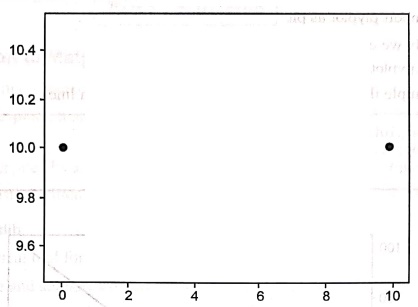
Plotting without a line
In [15]: from matplotlib import pyplot as plt
plt.plot([0,10], [10, 10], 'o')
plt.show()
Output
Ex 11.
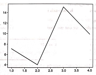
Plot using multiple points
Draw lines (1,7),(2,4), (3,15),(4,10)
Solution:
In [16]: from matplotlib import pyplot as plt
import numpy as np
x = np.array([1,2,3,4])
y = np.array([7,4,15,10])
plt.plot(x,y)
plt.show()
Output
Ex 12.
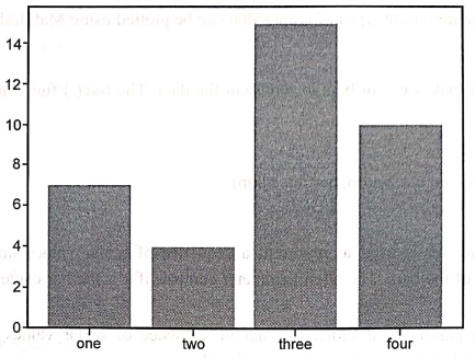
Bar graphs
In [17]: from matplotlib import pyplot as plt
import numpy as np
x = np.array(["one", "two", "three", "four"])
y = np.array([7,4,15,10])
plt.bar(x,y)
plt.show()
Output
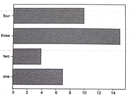
Ex 13. Bar graphs
import numpy as np
x = np.array(["one", "two","three", "four"])
y = np.array([7,4,15,10])
plt.barh(x,y)
plt.show()
Output
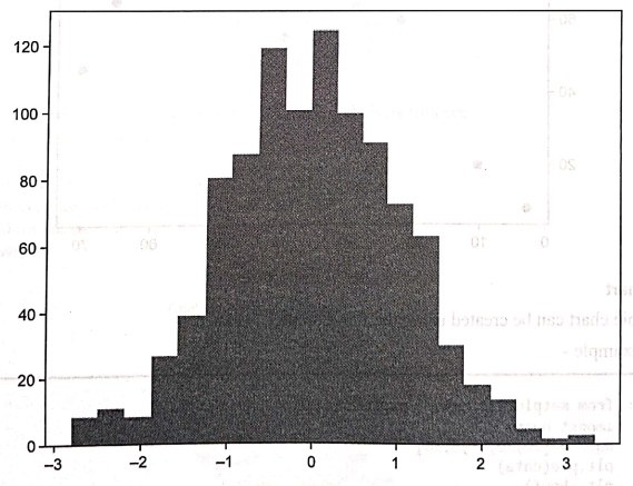
Ex 14.
Histogram
In [9]: from matplotlib import pyplot as plt
import numpy as np
data = np.random.randn(1000)
plt.hist(data, bins=20)
plt.show()
Output
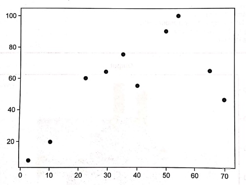
Ex 15.
Scatter plots
In [12]: from matplotlib import pyplot as plt
import numpy as np
age = np.array([10,22,35,50,40,3,65,54,29,70])
weight = np.array([20,60,75,90,55,8,65,100,64,46])
plt.scatter(age, weight)
plt.show()
Output
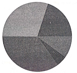
Ex 16.
Pie chart
In [8]: from matplotlib import pyplot as plt
import numpy
data = [20,30,35,5,10]
plt.pie(data)
plt.show()
Output
Ex 17.
Pie chart
from matplotlib import pyplot as plt
import numpy
data = [20,30,35,5,10]
1 = ["OPPO","OnePlus","Samsung", "Apple", "Vivo"]
plt.pie(data,labels = 1)
plt.show()
Output
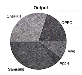
Ex 18.
Pie chart
from matplotlib import pyplot as plt
import numpy
data = [20,30,35,5,10]
1 =["OPPO","OnePlus", "Samsung", "Apple", "Vivo"]
plt.pie(data,labels = 1,autopct=%1.1f%%')
plt.show()
Output
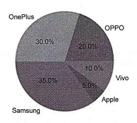
Ex 19.
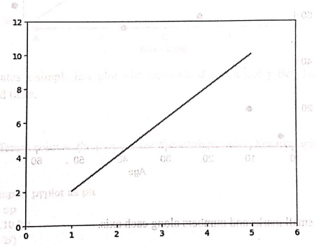
Setting Axis Limits
Python program
import matplotlib.pyplot as plt
x = [1,2,3,4,5]
y = [2,4,6,8,10]
plt.plot(x,y)
plt.xlim(0,6)
plt.ylim(0,12)
plt.show()
Output
Ex 20.
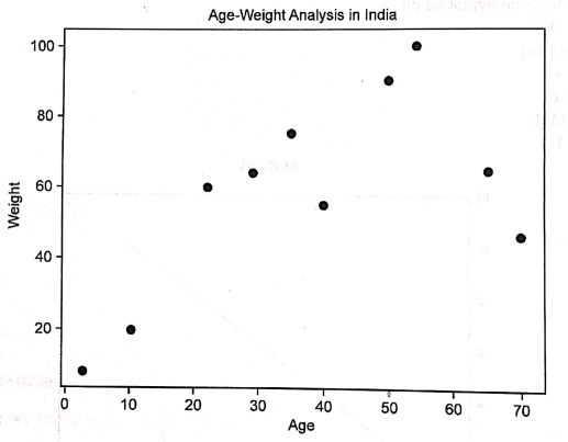
Titles and Labels
In [11]: from matplotlib import pyplot as plt
import numpy as np
age = np.array([10,22,35,50,40,3,65,54,29,70])
weight = np.array([20,60,75,90,55,8,65,100,64,46])
plt.scatter(age, weight)
plt.title("Age‒Weight Analysis in India")
plt.xlabel("Age")
plt.ylabel("weight")
plt.show()
Output
Ex 21.
Ticks
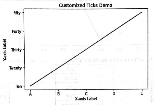
Syntax
plt.xticks([list of tick values])
plt.yticks([list of tick values])
Python program
import matplotlib.pyplot as plt
x = [1, 2, 3, 4, 5]
y = [10, 20,30, 40,50]
plt.plot(x, y, label='Sample Line')
plt.xticks([1, 2, 3, 4, 5], ['A', 'B', 'C', 'D', 'E'],color='red')
plt.yticks([10, 20, 30, 40, 50], ['Ten', 'Twenty', 'Thirty', 'Forty', 'fifty'])
plt.xlabel('X‒axis Label')
plt.ylabel('Y‒axis Label')
plt.title('Customized Ticks Demo')
plt.show()
Output
Ex 22.
Colors
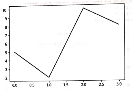
Python code
from matplotlib import pyplot as plt
import numpy as np
y = np.array([5,2,10,8])
plt.plot(y,color = 'b')
plt.show()
Output
Ex 23.
Adding Text
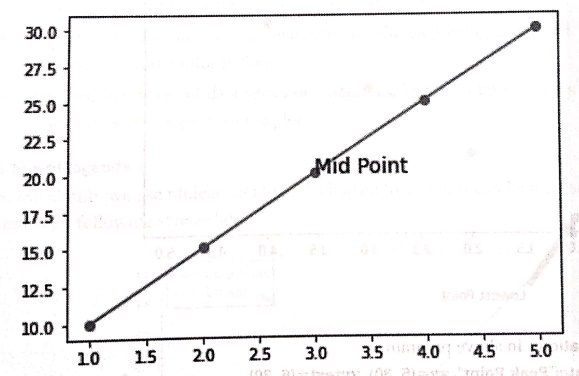
Demo example
import matplotlib.pyplot as plt
x = [1, 2, 3, 4, 5]
y = [10, 15, 20, 25, 30]
plt.plot(x, y,marker='0')
# Add text
plt.text(3, 20, "Mid Point", fontsize=14, color='black')
plt.show()
Output
Ex 24.
Adding annotations
import matplotlib.pyplot as plt
x = [1, 2, 3, 4, 5]
y = [10, 15, 20, 25, 30]
# Scatter plot
plt.scatter(x, y, color='green')
# Annotate the highest point
plt.annotate("Peak Point", xy=(5, 30), xytext=(6, 30),
arrowprops=dict(arrowstyle="‒>"), fontsize=12)
# Annotate the lowest point
plt.annotate("Lowest Point", xy=(1, 10), xytext=(1.5, 4),
arrowprops=dict(facecolor='blue', shrink=0.02))
plt.show()
Output
Code explanation: In above program,
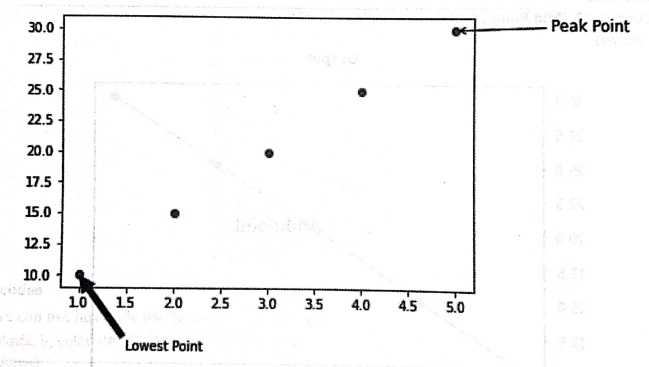
1) plt.annotate("Peak Point", xy=(5, 30), xytext=(6, 30),
arrowprops=dict(arrowstyle="‒>"), fontsize=12)
• This line annotates the highest point (5, 30) with the label "Peak Point".
• The annotate() function is used for this purpose.
Ex 25.
Legends
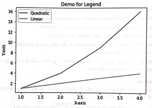
import matplotlib.pyplot as plt
x = [1, 2, 3, 4]
y1 = [1, 4, 9, 16]
y2 = [1, 2, 3, 4]
plt.plot(x,y1,label='Quadratic')
plt.plot(x,y2, label='Linear")
plt.legend()
plt.title('Demo for Legend')
plt.xlabel('X‒axis')
plt.ylabel('Y‒axis')
plt.show()
Output
Code explanation: In above program,
1.We have created three different data sets namely x,y1 and y2.
2. Using plt.plot we draw two lines ‒ Using x,y1 the quadratic line is drawn and using x,y2 the linear line is drawn. When we plot data, you can add a label parameter to each plot element. These labels will be used in the legend.
3.To add a legend to the plot, we use the plt.legend() function.
4. Finally display the plot with title, xlabel and ylabel.
Ex :26
In the competitive business world, tracking sales trends over time is crucial for making informed decisions. Companies analyze sales data to identify which products perform well and to strategize future marketing efforts.
Write a Python code to plot the sales of three products in the four months. Make use of following data. And to distinguish each product sale make use of legend in your program.
months = ['Jan', 'Feb', 'Mar', 'Apr']
sales_a = [10, 15, 20, 25]
sales_b = [5, 10, 15, 20]
sales c= [7, 14, 21, 28]
Solution:
import matplotlib.pyplot as plt
months = ['Jan', 'Feb', 'Mar', 'Apr']
sales a = [10, 15, 20, 25]
sales_b = [5, 10, 15, 20]
sales_c = [7, 14, 21, 28]
plt.plot(months, sales_a, label='Product A')
plt.plot(months, sales_b, label='Product B')
plt.plot(months, sales_c, label='Product C')
plt.legend(title='Products', loc='upper left')
plt.title('Monthly Sales Data')
plt.xlabel('Month')
plt.ylabel('Sales')
plt.show()
Output

Ex 27.
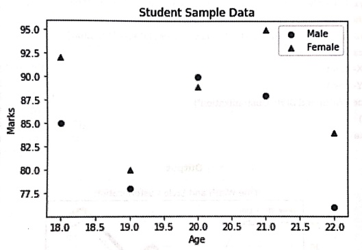
Educational institutions often analyze student performance to identify trends and improve teaching strategies. One important aspect of this analysis is understanding how students of different genders perform in academics across different age groups. Take hypothetical sample data of students' ages and marks for both males and females. Write a Python program Represent the data using a scatter plot where:
(a) Male students are marked with blue circles (0).
(b) Female students are marked with red triangles (^).
(c) Add a legend to indicate gender categories.
Solution :
import matplotlib.pyplot as plt
# Sample data (Age vs. Marks)
male_ages = [18, 19, 20, 21, 22]
male_marks = [85, 78, 90, 88, 76]
female_ages = [18, 19, 20, 21, 22]
female_marks = [92, 80, 89, 95, 84]
# Scatter plot
plt.scatter(male_ages, male_marks, color='blue', marker='o', label="Male") plt.scatter(female_ages, female_marks, color='red', marker='^', label="Female")
plt.xlabel("Age")
plt.ylabel("Marks")
plt.title("Student Sample Data")
plt.legend()
plt.show()
Output
Ex 28.
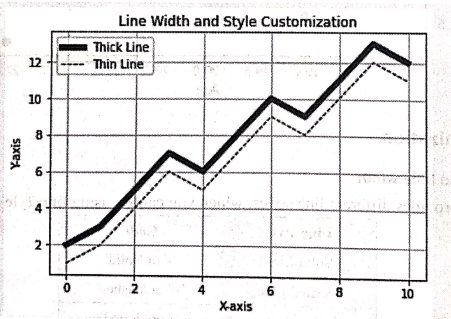
Customization: Line style and Line width
import matplotlib.pyplot as plt
import numpy as np
x = np.array([0, 1, 2, 3, 4, 5, 6, 7, 8, 9, 10])
y1 = np.array([2, 3, 5, 7, 6, 8, 10, 9, 11, 13, 12])
y2 = np.array([1, 2, 4, 6, 5, 7, 9, 8, 10, 12, 11])
#Thick solid line
plt.plot(x, y1, linestyle='', linewidth=5, color='blue', label="Thick Line')
#Thin dashed line
plt.plot(x, y2, linestyle='‒‒', linewidth=1, color='black', label="Thin Line')
# Customizations
plt.xlabel("X‒axis")
plt.ylabel("Y‒axis")
plt.title("Line Width and Style Customization")
plt.legend()
plt.grid(True)
plt.show()
Output
Line Width and Style Customization
Ex 29.
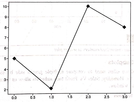
Customization: Marker
Python code
import numpy as np
y = np.array([5,2,10,8])
plt.plot(y,marker = 'D')
plt.show()
Output
Ex 30.
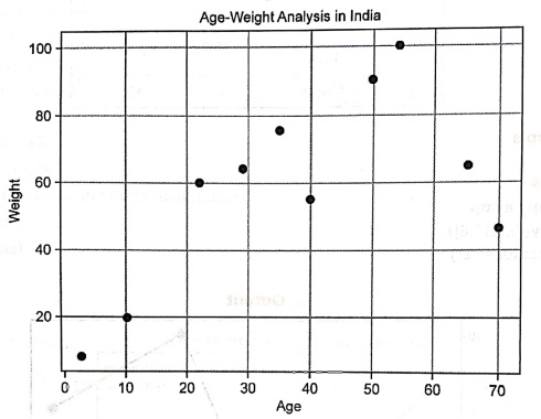
Customization: Grid and Background
from matplotlib import pyplot as plt
import numpy as np
age = np.array([10,22,35,50,40,3,65,54,29,70])
weight = np.array([20,60,75,90,55,8,65,100,64,46])
plt.scatter(age, weight)
plt.title("Age‒Weight Analysis in India")
plt.xlabel("Age")
plt.ylabel("Weight")
plt.grid()
plt.show()
Ex 31.
The subplot() function
Syntax
plt.subplot(nrows,ncols,index)
Python program
import matplotlib.pyplot as plt
x=(1,2,3,4,5]
y1=[2,4,6,8,10]
y2=[1,4,9,16,25]
plt.subplot(1,2,1)
plt.plot(x,y1,'r‒‒')
plt.title("plot#1")
plt.subplot(1,2,2)
plt.plot(x,y2,'b‒.')
plt.title("plot #2")
plt.suptitle("Main Plot")
plt.show()
Output
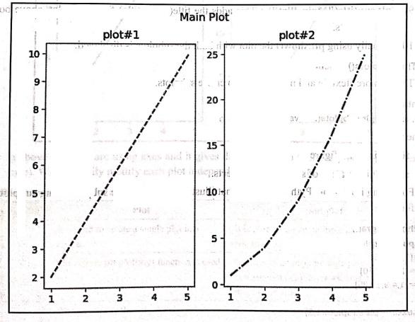
Code explanation: In above code,
1) We have imported the library file Matplotlib.
2) We have with us common x axis co‒ordinates and y1 and y2 arrays for y axis co‒ordinates.
3) plt.subplot(1, 2, 1): Creates a subplot grid with row 1 and two columns and activates first subplot.
4) plt.plot(x, y1, 'r‒‒'): It plots yl Vs x in the first subplot. The 'r‒‒' means red dashed line.
5) plt.title("plot#1"): Sets the title of the first subplot.
6) plt.subplot(1, 2, 2): Activates the second subplot in the same 1*2 grid.
7) plt.plot(x, y2, 'b‒.'): It plots y2 vs x in the second subplot. The 'b‒.' means blue dash (lol reM)eluque lig dot line.
8) plt.title("plot#2"): Sets the title of the second subplot.
9) plt.suptitle("Main Plot"): This adds the title(super title) for entire plot, above both the subplots.
10) Finally using plt.show() the plot with both the subplots is displayed.
Ex 32.
The subplots() function
syntax
fig, axes = plt.subplots(nrows, ncols)
Python program
import matplotlib.pyplot as plt
x=(1,2,3,4,5]
y1=[2,4,6,8,10]
y2=[1,4,9,16,25]
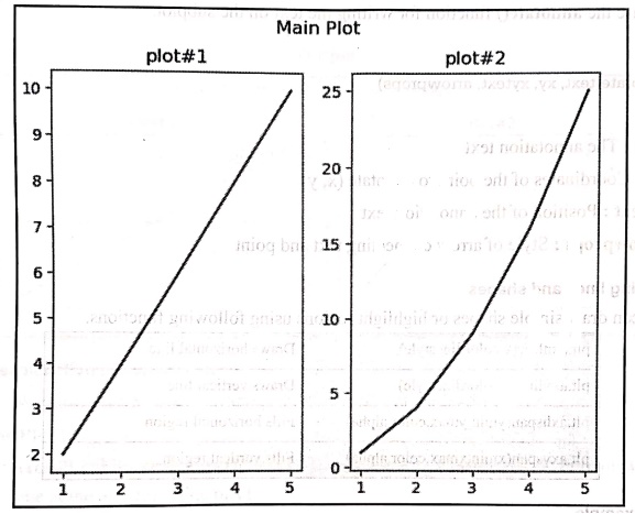
fig,axes = plt.subplots(1,2)
axes[0].plot(x,y1,color = 'red')
axes[0].set_title("plot#1")
axes[1].plot(x,y2,color = 'blue')
axes[1].set_title("plot#2")
plt.suptitle("Main Plot")
plt.show()
Output
Ex 33.
Drawing lines and shapes
import matplotlib.pyplot as plt
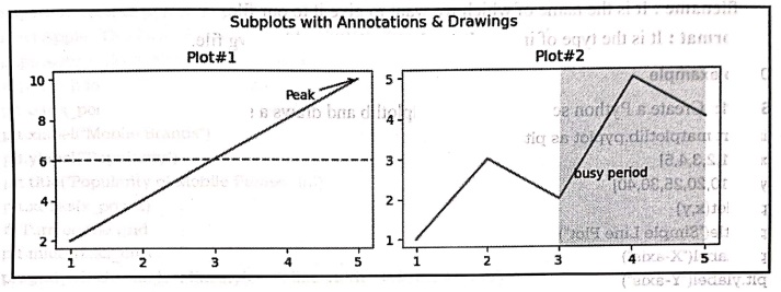
fig, axes = plt.subplots(1,2, figsize=(8,3))
x = [1,2,3,4,5]
y1 = [2,4,6,8,10]
y2 = [1,3,2,5,4]
axes[0].plot(x,y1)
axes[0].set_title("Plot#1")
axes[0].axhline(y=sum(y1)/len(y1), linestyle="‒‒") # average line
axes[0].annotate("Peak", xy=(5,10), xytext=(4,9), arrowprops= dict(arrowstyle="‒>"))
axes[1].plot(x,y2)
axes[1].set_title("Plot#2")
axes[1].axvspan(3,5, alpha=0.12) # highlight x range
axes[1].text(3.2, 2.5, "busy period")
fig.suptitle("Subplots with Annotations & Drawings")
plt.tight_layout()
plt.show()
Output
Ex 34.
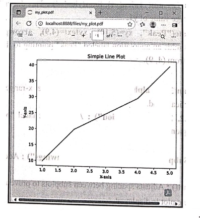
Saving Plots to Files
import matplotlib.pyplot as plt
x = [1,2,3,4,5]
y = [10,20,25,30,40]
plt.plot(x,y)
plt.title("Simple Line Plot")
plt.xlabel("X‒axis")
plt.ylabel("Y‒axis")
plt.savefig("my_plot.pdf")
plt.show()
Step 2:
Open my_plot.pdf which gets created at the current working directory. This pdf file stored the plot created by above Python program.
Python for Data Science: Laboratory Programs in Python : Tag: Computer Programming, Python, Data Science : Laboratory Programs in Python - Line plot, bar plot, histogram, and box plot
Python for Data Science: Laboratory Programs in Python
Under Subject
Python for Data Science
AD25201 2nd Semester AIDS Dept | 2025 Regulation | 2nd Semester 2025 Regulation
Python for Data Science - Laboratory
AD25201 2nd Semester AIDS Dept | 2025 Regulation | 2nd Semester 2025 Regulation
Related Subjects

English Essentials II
EN25C02 2nd Semester | 2025 Regulation | 2nd Semester 2025 Regulation

Tamils and Technology தமிழர்களும் தொழில்நுட்பமும்
UC25H02 2nd Semester | 2025 Regulation | 2nd Semester 2025 Regulation

Linear Algebra
MA25C02 2nd Semester | 2025 Regulation

Applied Physics (CSIE) II
PH25C03 2nd Semester AIDS, CSE, IT, CSE(CY) Dept | 2025 Regulation | 2nd Semester 2025 Regulation

Digital Principles and Computer Organization
CS25C06 2nd Semester AIDS, CSE, IT, CSE(CY) Dept | 2025 Regulation | 2nd Semester 2025 Regulation

Basic Electrical and Electronics Engineering
EE25C01 2nd Semester | 2025 Regulation | 2nd Semester 2025 Regulation
Python for Data Science
AD25201 2nd Semester AIDS Dept | 2025 Regulation | 2nd Semester 2025 Regulation

Re-Engineering for Innovation
ME25C05 2nd Semester | 2025 Regulation | 2nd Semester 2025 Regulation
Python for Data Science - Laboratory
AD25201 2nd Semester AIDS Dept | 2025 Regulation | 2nd Semester 2025 Regulation