Python for Data Science: Chapter 6: Data Visualization
Data Visualization - Matplotlib and Seaborn: Two Marks Important Questions and Answers
Python for Data Science
Python for Data Science: Chapter 6: Data Visualization - Matplotlib and Seaborn : Anna University Part A Two Marks Important Questions and Answers
Python for Data Science
Chapter 6: Data Visualization – Matplotlib and Seaborn
Two Marks Questions with Answers
1. What
is visualization ?
Answer: Visualization
means representing data or information in the form of graph instead of just
numbers or text.
For
example ‒ a bar chart or histogram makes it easy to see who scored high, low,
and how scores are spread.
2. What
is the difference between matlab and matplotlib ?
Answer:
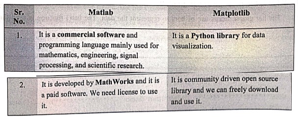
Matlab
1.It
is a commercial software and
programming language mainly used for mathematics, engineering, signal processing,
and scientific research.
2.It
is developed by MathWorks and it is
a paid software. We need license to use it.
Matplotlib
1.It
is a Python library for data
visualization.
2.It
is community driven open source library and we can freely download and use it.
3. Is a
histogram always a bar chart? Justify your answer.
Answer: A
histogram looks like a bar chart, but it is not the same because it is meant for continuous data and shows
frequency distribution, while a bar chart is for categorical data and shows
comparisons. There is no gaps in histogram but there are gaps between bars of
bar chart.
4. What
is the use of Matplotlib?
Answer: Matplotlib
is a Python library used to create visualizations (charts and graphs).
It
helps turn numbers (data) into pictures, so patterns and trends are easier to
understand.
5. What
command is used to verify that Matplotlib is installed?
Answer: The
command like
pip
show matplotlib
This
will display details like version, location, and dependencies if Matplotlib is
installed.
6. Enlist
data visualization libraries in Python.
Answer: The
libraries are ‒
1)
Matplotlib
2)
Plotly
3)
ggplot
4)
Seaborn
5)
Geoplotlib
7. What
is matplotlib library? Enlist the features of it.
Answer: Matplotlib
is an open source drawing library. We can generate plots, histograms, bar
charts and other types of charts
with few lines of codes.
Features
are ‒
1)
It is a powerful tool for data analysis.
2)
It is flexible and supports various forms of data representations.
3)
It is easy to access large amount of data using Matplotlib.
4)
It is customizable.
5)
It can run on different platforms.
6)
It is useful in creating advanced visualizations.
8. What
is the purpose of bar graph?
Answer: The
bar graph makes use of bars to represent the data. The bar() function is used
for this purpose.
9.
Explain the purpose histogram in data science.
Answer: The
histogram is used to understand the distribution of a continuous numerical
variable. A histogram is a graph showing frequency distributions. It is a graph
showing the number of observations within each given interval. For example ‒ To
represent the weights of 1000 people we may use histogram. Using Matplotlib, we
can draw the histogram using the function hist() function. The hist() function
will use an array of numbers as data to create a histogram.
10. What
is the use of marker in graph plotting ?
Answer: The
marker parameter can be used to create "markers" in a plot. You can
specify the shape of the marker by passing a value to the parameter. For
example ‒
from matplotlib import pyplot as plt
import numpy as np
y = np.array([5,2,10,8])
plt.plot(y,marker = 'D')
plt.show()
11. Why
do we use seaborn library in Python ?
Answer: Seaborn
is a Python data visualization library based on matplotlib. It provides a high
level interface for drawing attractive and informative statistical graphics.
Seaborn is built on top of matplotlib and integrates closely with Pandas data
structures. Seaborn is particularly well suited for working with complex data
sets.
12. How
will you import seaborn library in your python program ?
Answer: For
importing the seaborn library following code must be written at the beginning
of your import seaborn as sns
13. What
is heatmap?
Answer: Heatmap
allows us to represent the data in matrix‒like form. In this Heatmap, more
common values or higher activities brighter colors, basically reddish colors
are used and to represent less common or activity values, darker colors are
preferred.
14. Can
we show multiple graph plots in the same figure? Justify.
Answer: Subplot
is used for displaying multiple plots in the same plot. Using the subplot()
method one can draw multiple plots in one figure.
Python
program
import matplotlib.pyplot as plt
x = [1, 2, 3, 4, 5]
y = [10, 20,30, 40,50]
plt.plot(x, y, label='Sample Line')
plt.xticks([1,
2, 3, 4, 5], ['A', 'B', 'C', 'D', 'E'],color='red')
plt.yticks([10,
20, 30, 40, 50], ['Ten', 'Twenty', 'Thirty', 'Forty', 'fifty'])
plt.xlabel('X‒axis Label')
plt.ylabel('Y‒axis Label')
plt.title('Customized Ticks Demo')
plt.show()
Output
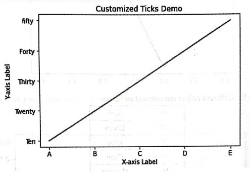
This code creates a simple line plot with customized x‒tick and y‒tick labels.,
The xticks are red colored ticks.
15. How
to set titles to the graph, X‒axis and Y‒axis labels.
Answer: For setting
title to the graph the set_title() method is used. Similarly we can set the
labels to the x‒axis and y‒axis using the methods set_xlabel and set_ylabel.
Example code
import numpy as np
import pandas as pd
import matplotlib.pyplot as plt
import seaborn as sns
# read dataset
titanic = pd.read_csv("d:/titanic.csv")
print(titanic.head())
# create plot
res=sns.countplot(x = 'Pclass',hue='Sex', data = titanic)
res.set_title("Titanic Survivors', fontdict={'size': 20,
'weight': 'bold'})
res.set_xlabel('Class', fontdict={'size': 10})
res.set_ylabel('count of Persons', fontdict={'size': 10})
plt.show()
16. Write
Python program using plot function for simple line plot omitting X‒axis values.
Answer:
import matplotlib.pyplot as plt
# Only Y values are given
y = [3, 5, 7, 9, 11, 13]
# Plot without specifying X values
plt.plot(y)
# Show plot
plt.show()
17. What
are scatter plots?
Answer: A
scatter plot is a type of graph that shows the relationship between two
numerical variables. Each point on the plot represents one observation.
18. What
is a subplot in Matplotlib?
Answer: Subplot
is a function in matplotlib which is used for displaying multiple plots in the
same plot. Using the subplot() method one can draw multiple plots in one
figure.
19. What
is the difference between plot and subplot.
Answer:
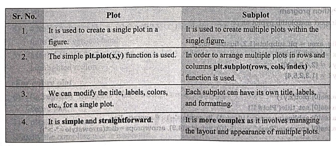
Plot
1.It
is used to create a single plot in a figure.
2.The
simple plt.plot(x,y) function is
used.
3.We
can modify the title, labels, colors, etc., for a single plot.
4.It
is simple and straightforward.
Subplot
1.It
is used to create multiple plots within the single figure.
2.In
order to arrange multiple plots in rows and columns plt.subplot(rows, cols, index)
function is used.
3.Each
subplot can have its own title, labels, and formatting.
4.It
is more complex as it involves
managing agongwans ( the layout and appearance of multiple plots.
20. Explain
the use of seaborn library?
Answer: Seaborn
is a Python library built on top of Matplotlib. It is mainly used for making
statistical data visualizations that look more attractive and easier to
understand than plain Matplotlib plots.
Python for Data Science: Chapter 6: Data Visualization : Tag: Computer Programming, Python, Data Science : Python for Data Science - Data Visualization - Matplotlib and Seaborn: Two Marks Important Questions and Answers
Python for Data Science: Chapter 6: Data Visualization
Under Subject
Python for Data Science
AD25201 2nd Semester AIDS Dept | 2025 Regulation | 2nd Semester 2025 Regulation
Related Subjects

English Essentials II
EN25C02 2nd Semester | 2025 Regulation | 2nd Semester 2025 Regulation

Tamils and Technology தமிழர்களும் தொழில்நுட்பமும்
UC25H02 2nd Semester | 2025 Regulation | 2nd Semester 2025 Regulation
Linear Algebra
MA25C02 2nd Semester | 2025 Regulation

Applied Physics (CSIE) II
PH25C03 2nd Semester AIDS, CSE, IT, CSE(CY) Dept | 2025 Regulation | 2nd Semester 2025 Regulation
Digital Principles and Computer Organization
CS25C06 2nd Semester AIDS, CSE, IT, CSE(CY) Dept | 2025 Regulation | 2nd Semester 2025 Regulation

Basic Electrical and Electronics Engineering
EE25C01 2nd Semester | 2025 Regulation | 2nd Semester 2025 Regulation
Python for Data Science
AD25201 2nd Semester AIDS Dept | 2025 Regulation | 2nd Semester 2025 Regulation

Re-Engineering for Innovation
ME25C05 2nd Semester | 2025 Regulation | 2nd Semester 2025 Regulation
Python for Data Science - Laboratory
AD25201 2nd Semester AIDS Dept | 2025 Regulation | 2nd Semester 2025 Regulation