Python for Data Science: Chapter 6: Data Visualization
Matplotlib: Customization
Python open source drawing library
Discuss various customized markers in scatter plot. 1) Line style and Line width 2) Marker 3) Grid and Background
Customization
1) Line style and Line width
•
Matplotlib provides different line
styles, which you can set using linestyle
or Is.
Line
style Code
Solid Line
'‒' or 'solid'
Dashed Line
'‒‒' or 'dashed'
Dotted Line ':' or
'dotted'
Dash‒Dot Line ' ‒,' or 'dashdot'
•
Similarly we can change the line width using linewidth or lw
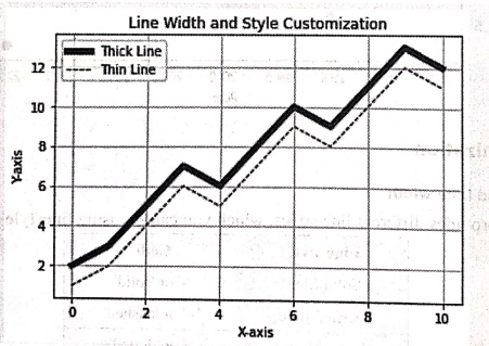
parameter. Following is a demo example in which we set the line style and line
width and color to the lines.
Demo
example
import matplotlib.pyplot as plt
import numpy as np
x = np.array([0, 1, 2, 3, 4, 5, 6, 7, 8, 9, 10])
y1 = np.array([2, 3, 5, 7, 6, 8, 10, 9, 11, 13, 12])
y2 = np.array([1, 2, 4, 6, 5, 7, 9, 8, 10, 12, 11])
#Thick solid line
plt.plot(x, y1, linestyle='', linewidth=5, color='blue',
label="Thick Line')
#Thin dashed line
plt.plot(x, y2, linestyle='‒‒', linewidth=1, color='black',
label="Thin Line')
# Customizations
plt.xlabel("X‒axis")
plt.ylabel("Y‒axis")
plt.title("Line Width and Style Customization")
plt.legend()
plt.grid(True)
plt.show()
Output
Line Width and Style
Customization
2) Marker
•
We use markers to highlight data points
in a line plot. The marker parameter in the plot() function allows us to
customize point styles, sizes and colors.
•
There are various marker styles and those are enlisted in the following table.
Marker
type Code
Circle 'o'
Square 'g'
Triangle up '^'
Triangle down 'v'
Diamond 'D'
Star '*'
Plus '+'
Cross 'x'
Demo example
Python
code
import numpy as np
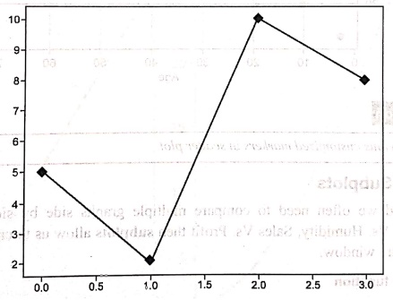
y = np.array([5,2,10,8])
plt.plot(y,marker = 'D')
plt.show()
Output
•
The diamond shaped marker will be displayed on the line.
3) Grid and Background
•
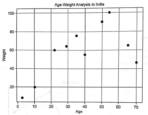
For displaying the Grid in the graph, we use grid() function. The code is as follows‒
from matplotlib import pyplot as plt
import numpy as np
age = np.array([10,22,35,50,40,3,65,54,29,70])
weight = np.array([20,60,75,90,55,8,65,100,64,46])
plt.scatter(age, weight)
plt.title("Age‒Weight Analysis in India")
plt.xlabel("Age")
plt.ylabel("Weight")
plt.grid()
plt.show()
Review Question
1. Discuss various
customized markers in scatter plot.
Python for Data Science: Chapter 6: Data Visualization : Tag: Computer Programming, Python, Data Science : Python open source drawing library - Matplotlib: Customization
Python for Data Science: Chapter 6: Data Visualization
Under Subject
Python for Data Science
AD25201 2nd Semester AIDS Dept | 2025 Regulation | 2nd Semester 2025 Regulation
Related Subjects

English Essentials II
EN25C02 2nd Semester | 2025 Regulation | 2nd Semester 2025 Regulation

Tamils and Technology தமிழர்களும் தொழில்நுட்பமும்
UC25H02 2nd Semester | 2025 Regulation | 2nd Semester 2025 Regulation
Linear Algebra
MA25C02 2nd Semester | 2025 Regulation

Applied Physics (CSIE) II
PH25C03 2nd Semester AIDS, CSE, IT, CSE(CY) Dept | 2025 Regulation | 2nd Semester 2025 Regulation

Digital Principles and Computer Organization
CS25C06 2nd Semester AIDS, CSE, IT, CSE(CY) Dept | 2025 Regulation | 2nd Semester 2025 Regulation

Basic Electrical and Electronics Engineering
EE25C01 2nd Semester | 2025 Regulation | 2nd Semester 2025 Regulation
Python for Data Science
AD25201 2nd Semester AIDS Dept | 2025 Regulation | 2nd Semester 2025 Regulation

Re-Engineering for Innovation
ME25C05 2nd Semester | 2025 Regulation | 2nd Semester 2025 Regulation
Python for Data Science - Laboratory
AD25201 2nd Semester AIDS Dept | 2025 Regulation | 2nd Semester 2025 Regulation