Python for Data Science: Chapter 6: Data Visualization
Types of Plots in Matplotlib
Python open source drawing library
Questions: 1. What is Matplotlib? Enlist its feature. 2.What is the use of Pyplot in Matplotlib? 3.What are the types of plots in Matplotlib ? 4.How to create piechart in Matplotlib? Give an example. 4. Bar graphs, Histogram, Scatter plots, Pie chart
Types of
Plots in Matplotlib
•
There are three important types of graphs that can be plotted using Matplotlib.
These are
1) Bar graphs
•
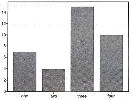
The bar graph makes use of bars to represent the data. The bar() function is used for this purpose.
Syntax
ax.bar(x, height,
width, bottom, align)
Parameters
• x:
This parameter is used to represent a sequence of scalar values that represents
the x coordinates of the bars. The align parameter controls if x is the bar
center (default) or left edge.
•
height: This parameter is either a scalar or
sequence of scalar values representing the height(s) of the bars which makes
the y‒axis value.
•
width: This parameter is either a scalar or
array‒like and it is optional. The default value of this parameter is 0.8.
• bottom:
This is also a scalar or array‒like and it is optional. The default value is
None.
• align: The values of this
parameter are {'center', 'edge'}, optional and the default value of this
parameter is 'center'.
Example
•
Following program displays simple bar chart.
In [17]:
from matplotlib
import pyplot as plt
import numpy as np
x = np.array(["one", "two",
"three", "four"])
y = np.array([7,4,15,10])
plt.bar(x,y)
plt.show()
Output
•
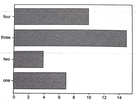
If we want to draw horizontal bar graph, we use barh() function. For instance ‒
from
matplotlib import pyplot as plt
import numpy as np
x = np.array(["one",
"two","three", "four"])
y = np.array([7,4,15,10])
plt.barh(x,y)
plt.show()
Output
2) Histogram
•
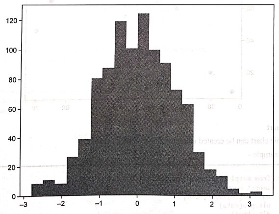
The histogram is used to understand the
distribution of a continuous numerical variable. A histogram is a graph showing
frequency distributions. It is a graph showing the number of observations
within each given interval.
•
For example ‒ To represent the weights
of 1000 people we may use histogram.
•
Using Matplotlib, we can draw the histogram using the function hist() function. The hist() function will use an array of
numbers as data to create a histogram, the array is sent into the function as
an argument.
•
A histogram shows the frequency on the vertical axis and the horizontal axis is
another dimension. Usually it has bins,
where every bin has a minimum and maximum value. Each bin also has a frequency
between data and infinite.
•
For example ‒
In [9]:
from matplotlib import
pyplot as plt
import numpy as np
data = np.random.randn(1000)
plt.hist(data, bins=20)
plt.show()
Output
3) Scatter plots
•
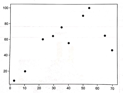
Scatter plots are used to represent values for two different numeric variables.
The scatter() function plots one dot
for each observation. It needs two arrays of the same length, one for the
values of the x‒axis and one for values on the y‒axis.
•
For example ‒ Following is a plot of 10 people of different age group who have
different weights in kgs.
In [12]:
from matplotlib import
pyplot as plt
import numpy as np
age = np.array([10,22,35,50,40,3,65,54,29,70])
weight = np.array([20,60,75,90,55,8,65,100,64,46])
plt.scatter(age, weight)
plt.show()
Output
4) Pie chart
•
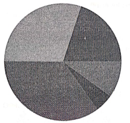
The pie chart can be created using the
function pie() is used.
•
For example ‒
In [8]:
from matplotlib import
pyplot as plt
import numpy
data = [20,30,35,5,10]
plt.pie(data)
plt.show()
Output
•
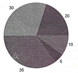
By default the plotting of the first wedge starts from the x‒axis and moves
counterclockwise, Hence the data is plotted as follows –
•
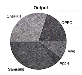
We can also label the elements of pie chart. The code is as follows –
from matplotlib import pyplot as plt
import numpy
data = [20,30,35,5,10]
1 = ["OPPO","OnePlus","Samsung",
"Apple", "Vivo"]
plt.pie(data,labels = 1)
plt.show()
Output
•
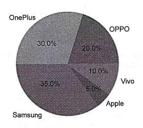
We can display the percentage data in
the pie chart as follows –
from matplotlib import pyplot as plt
import numpy
data = [20,30,35,5,10]
1 =["OPPO","OnePlus", "Samsung",
"Apple", "Vivo"]
plt.pie(data,labels = 1,autopct=%1.1f%%')
plt.show()
Output
Review Questions
1. What is Matplotlib?
Enlist its feature.
2.What is the use of
Pyplot in Matplotlib?
3.What are the types
of plots in Matplotlib ?
4.How to create
piechart in Matplotlib? Give an example.
Python for Data Science: Chapter 6: Data Visualization : Tag: Computer Programming, Python, Data Science : Python open source drawing library - Types of Plots in Matplotlib
Python for Data Science: Chapter 6: Data Visualization
Under Subject
Python for Data Science
AD25201 2nd Semester AIDS Dept | 2025 Regulation | 2nd Semester 2025 Regulation
Related Subjects

English Essentials II
EN25C02 2nd Semester | 2025 Regulation | 2nd Semester 2025 Regulation

Tamils and Technology தமிழர்களும் தொழில்நுட்பமும்
UC25H02 2nd Semester | 2025 Regulation | 2nd Semester 2025 Regulation

Linear Algebra
MA25C02 2nd Semester | 2025 Regulation

Applied Physics (CSIE) II
PH25C03 2nd Semester AIDS, CSE, IT, CSE(CY) Dept | 2025 Regulation | 2nd Semester 2025 Regulation

Digital Principles and Computer Organization
CS25C06 2nd Semester AIDS, CSE, IT, CSE(CY) Dept | 2025 Regulation | 2nd Semester 2025 Regulation

Basic Electrical and Electronics Engineering
EE25C01 2nd Semester | 2025 Regulation | 2nd Semester 2025 Regulation
Python for Data Science
AD25201 2nd Semester AIDS Dept | 2025 Regulation | 2nd Semester 2025 Regulation

Re-Engineering for Innovation
ME25C05 2nd Semester | 2025 Regulation | 2nd Semester 2025 Regulation
Python for Data Science - Laboratory
AD25201 2nd Semester AIDS Dept | 2025 Regulation | 2nd Semester 2025 Regulation