Python for Data Science: Chapter 6: Data Visualization
Seaborn: 3D Plot of Surface
Python data visualization library
Question: How to visualize a three dimensional function in Python? Illustrate with a code. Index: 1. The 3D scatter plot 2. The 3D line plot 3. The 3D surface plot
3D Plot
of Surface
•
Matplotlib provides the Axes3D module to create 3D plots. The mpl_toolkits.mplot3d library enables
plotting in three dimensions.
•
The add_subplot() method is used in
3D plotting.
•
ax
= fig.add_subplot(111, projection='3d') does not create a 3D plot by
itself. It only creates a 3D plotting area (axes) inside the figure. To
actually plot something, we need to add a scatter plot or line plot using
additional commands.
1. The 3D scatter plot
•
A 3D
scatter plot is used to display data points in three dimensions (X, Y, Z).
It helps visualize the relationship between three variables. Each dot
represents a data point in 3D space.
Demo example
import numpy as np
import matplotlib.pyplot as plt
from mpl_toolkits.mplot3d import Axes3D
fig = plt.figure()
# Add a 3D subplot
ax = fig.add_subplot(111, projection='3d')
# Generate sample data
np.array([1, 2, 3, 4, 5, 6, 7, 8, 9, 10])
y = np.array([5, 3, 8, 12, 7, 9, 4, 6, 10, 15])
z = np.array([10, 12, 14, 8, 6, 9, 11, 7, 5, 13])
# Create a 3D scatter plot
ax.scatter(x, y, z, color='brown', marker='0')
# Set custom tick marks
ax.set_xticks([1, 3, 5, 7, 9])
ax.set_yticks([3, 6, 9, 12, 15])
ax.set_zticks([5, 7, 9, 11, 13])
ax.set_xlabel("X‒axis")
ax.set_ylabel("Y‒axis")
ax.set_zlabel("Z‒axis")
ax.set_title("Simple 3D Scatter Plot Demo")
plt.show()
Output
Simple 3D Scatter Plot
Demo
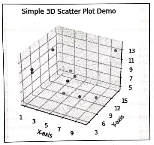
Code explanation: In above code,
1)
We have imported three library files
•
numpy: Helps us create and manipulate arrays
(for x, y, z data).
•
matplotlib.pyplot: Used for creating plots and
visualizations.
• mpl_toolkits.mplot3d:
Allows us to create 3D plots in Matplotlib.
2) plt.figure() :
Creates an empty figure (window) where we can add plots.
3) fig.add_subplot(111,
projection='3d'): Adds a 3D subplot inside the figure.
111 means 1 row, 1 column, and 1st (only) subplot. projection='3d' tells
Matplotlib to create a 3D plot instead of the default 2D.
4)
We create three arrays (x, y, z),
each containing 10 values. These values represent coordinates in a 3D space.
Each (x, y, z) point is one dot in the 3D scatter plot.
5)
ax.scatter(x, y, z, color='brown',
marker='o') : Plots brown dots (o) at (x, y, z) positions.
6)
Then we set Tick marks on x,y and z axis. Tick
marks are the numbers shown on
the axes.
7)
Then the x, y and z axis labels and title to the plot is created.
8)
plt.show(): Displays the figure with
the 3D scatter plot. Until we call plt.show(), nothing appears on the screen.
2. The 3D line plot
•
A 3D line plot connects points in 3D
space, showing trends over three variables.
Demo example
import numpy as np
import matplotlib.pyplot as plt
from mpl_toolkits.mplot3d import Axes3D
x = [1, 2, 3, 4, 5]
y = [2, 3, 5, 7, 11]
z = [1, 4, 6, 8, 10]
fig = plt.figure()
fig.add_subplot(111, projection='3d')
ax.plot(x, y, z, marker='0')
ax.set_xlabel('X axis')
ax.set_ylabel('Y axis')
ax.set_zlabel('Z axis')
ax.set_title('Simple 3D Line Plot Demo')
plt.show()
Output
Simple 3D Line Plot
Demo
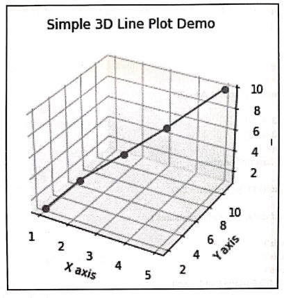
Code explanation: In
above code,
1)
We have imported three library files
•
numpy: Helps us create and manipulate arrays
(for x, y, z data).
•
matplotlib.pyplot :
Used
for creating plots and visualizations.
•
mpl_toolkits.mplot3d:
Allows us to create 3D plots in Matplotlib.
2) plt.figure() :
Creates an empty figure (window) where we can add plots.
3) fig.add_subplot(111,
projection='3d'): Adds a 3D subplot inside the figure.
111 means 1 row, 1 column, and 1st (only) subplot. projection='3d' tells
Matplotlib to create a 3D plot instead of the default 2D.
4)
We create three arrays (x, y, z),
then using ax.plot(x, y, z, marker='0')
we draw a 3D line with marker for each point.
5)
Then the x,y and z axis labels and title to the plot is created.
6)
plt.show(): Displays the figure with
the 3D line plot.
3. The 3D surface plot
•
A surface plot is a three‒dimensional (3D) plot that shows the relationship
between three continuous variables.
•
It creates a 3D surface that represents
the z‒values for each pair of x and y coordinates.
•
Surface plots are commonly used to
visualize complex data and identify patterns, trends, and interactions between
variables.
Demo example
import numpy as np
import matplotlib.pyplot as plt
from mpl_toolkits.mplot3d import Axes3D
x = np.array([1, 2, 3, 4, 5])
y = np.array([1, 2, 3, 4, 5])
x, y = np.meshgrid(x, y)
z = x**3+ y**3 # Example surface
fig = plt.figure()
ax = fig.add_subplot(111, projection='3d')
asurf = ax.plot_surface(x, y, z, cmap='plasma')
ax.set_xlabel('X axis')
ax.set_ylabel('Y axis')
ax.set_zlabel('Z axis')
ax.set_title('Simple 3D Surface Plot Demo')
plt.show()
Output
Simple 3D Surface Plot
Demo
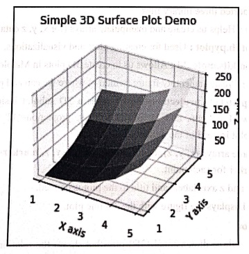
Example:1
Create an
intriguing 3D plot where the x values stretch from 0 to 10.
Let y
follow the parabolic path y = x^2.
Let z
shoot up in a cubic trajectory z = x^3.
1) Draw a
stunning blue line
2)
Customize the tick marks on all axes to guide the path.
3) Add a
stylish background color to your plot.
Solution :
import matplotlib.pyplot as plt
from mpl_toolkits.mplot3d import Axes3D
import numpy as np
# Data for plotting
x = np.linspace(0, 10, 100)
y = x**2
z = x**3
# Create a 3D plot
fig = plt.figure()
ax = fig.add_subplot(111, projection='3d')
# Plotting the 3D line
ax.plot(x, y, z, color='blue')
# Changing tick marks for all axes
ax.set_xticks([0, 2, 4, 6, 8, 10])
ax.set_yticks([0, 20, 40, 60, 80, 100])
ax.set_zticks([0, 200, 400, 600, 800, 1000])
# Changing the background color of the plot
ax.set_facecolor('lightgreen')
# Adding labels and title
ax.set_xlabel('X‒axis')
ax.set_ylabel('Y‒axis')
ax.set_zlabel('Z‒axis')
ax.set_title('3D Plotting Demo with Custom Ticks and Background
Color')
plt.show()
Output
3D Plotting Demo with
Custom Ticks and Background Color
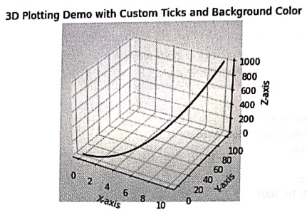
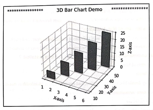
Example:2
Create a
3D bar chart where:
x = [1,
2, 3, 4, 5]
y=[10, 20,
30, 40, 50]
z=0 (all
bars start from height 0)
Heights
of bars = [5, 10, 15, 20, 25]
Use
ax.bar3d(x, y, z, dx, dy, dz) to create bars
Solution :
import matplotlib.pyplot as plt
from mpl_toolkits.mplot3d import Axes3D
import numpy as np
x = np.array([1, 2, 3, 4, 5])
y = np.array([10, 20, 30, 40, 50])
z = np.zeros(5) # All
bars start from height 0
dx = np.ones(5) # Width
of bars
dy= np.ones(5) # Depth of
bars
dz = np.array([5, 10, 15, 20, 25]) # Heights of bars
# Create a 3D plot
fig = plt.figure()
ax = fig.add_subplot(111, projection='3d')
# Plotting the 3D bars
ax.bar3d(x, y, z, dx, dy, dz, color='red')
# Adding labels and title
ax.set_xlabel('X‒axis')
ax.set_ylabel('Y‒axis')
ax.set_zlabel('Z‒axis')
ax.set_title('*************
3D Bar Chart Demo
************)
# Show plot
plt.show()
Output
Review Question
1. How to visualize a
three dimensional function in Python? Illustrate with a code.
Python for Data Science: Chapter 6: Data Visualization : Tag: Computer Programming, Python, Data Science : Python data visualization library - Seaborn: 3D Plot of Surface
Python for Data Science: Chapter 6: Data Visualization
Under Subject
Python for Data Science
AD25201 2nd Semester AIDS Dept | 2025 Regulation | 2nd Semester 2025 Regulation
Related Subjects

English Essentials II
EN25C02 2nd Semester | 2025 Regulation | 2nd Semester 2025 Regulation

Tamils and Technology தமிழர்களும் தொழில்நுட்பமும்
UC25H02 2nd Semester | 2025 Regulation | 2nd Semester 2025 Regulation

Linear Algebra
MA25C02 2nd Semester | 2025 Regulation

Applied Physics (CSIE) II
PH25C03 2nd Semester AIDS, CSE, IT, CSE(CY) Dept | 2025 Regulation | 2nd Semester 2025 Regulation

Digital Principles and Computer Organization
CS25C06 2nd Semester AIDS, CSE, IT, CSE(CY) Dept | 2025 Regulation | 2nd Semester 2025 Regulation

Basic Electrical and Electronics Engineering
EE25C01 2nd Semester | 2025 Regulation | 2nd Semester 2025 Regulation
Python for Data Science
AD25201 2nd Semester AIDS Dept | 2025 Regulation | 2nd Semester 2025 Regulation

Re-Engineering for Innovation
ME25C05 2nd Semester | 2025 Regulation | 2nd Semester 2025 Regulation
Python for Data Science - Laboratory
AD25201 2nd Semester AIDS Dept | 2025 Regulation | 2nd Semester 2025 Regulation