Python for Data Science: Chapter 6: Data Visualization
Seaborn: Making Sense of Data through Advanced Visualization
Python data visualization library
Various plotting techniques: 1) Bar plot 2) Countplot 3) Distribution plot 4) Heatmap 5) Scatterplot 6) Linear regression plot 7) Boxplot 8) Pairplot
Making
Sense of Data through Advanced Visualization
•
While working in statistical data analysis project, we need Numpy, Pandas,
Matplotlib and Seaborn libraries. So we need to import them in our Python code ‒
In [11]:
import numpy as np
import pandas as pd
import matplotlib.pyplot as plt
import seaborn as sns
%matplotlib inline
•
Now we need to load some data set present in the csv file. There are various
csv files present on the internet which can be downloaded and can be practiced
for data analysis. I have downloaded one such csv file named flight.csv. We will load this data set
using the Pandas read_csv() function.
In [12]:
flights = pd.read_csv("d:/flights.csv")
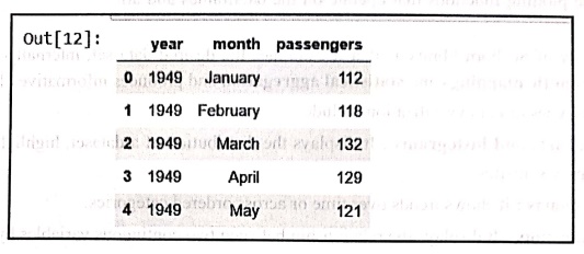
flights.head()
• The output will be ‒
• We can also using info() function to print the summary of data frame, It returns information
regarding data type, column data types, non‒null values and memory usage. For
example ‒
In [13]: flights.info()
<class pandas.core.frame.DataFrame">
RangeIndex: 144 entries,
0 to 143
Data columns (total 3 columns):
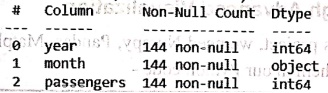
dtypes: int64(2), object(1)
memory usage: 3.5+ KB
• Now let us discuss various plotting
techniques in seaborn.
1) Bar plot
• The barplot is used to aggregate the
categorical data according to some methods and by default it's the mean. This
function computes the mean for each categorical variable and represents it with
bars and its confidence interval with error bars.
• To use this plot we choose a categorical
column for the x‒axis and a numerical column for the y‒axis. For example ‒ From
the file healthexp.csv we can find
out the health expenses spent by each country in US Dollars.
In [1]: import numpy as np
import pandas as pd
import matplotlib.pyplot as plt
import seaborn as sns
%matplotlib inline
health = pd.read_csv("d:/healthexp.csv")
res = sns.barplot(x='Country',y='Spending USD', data = health)
plt.show()
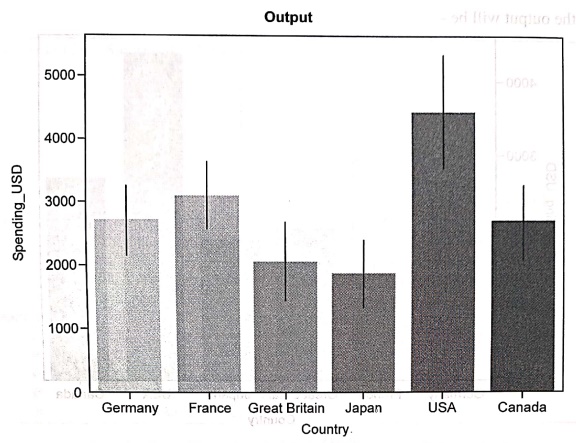
Output
Code explanation:
In above code,
•
We have imported numpy, pandas,
matplotlib and seaborn libraries.
•
Then we have loaded healthexp.csv file
using read_csv function.
•
There are two columns in this file healthexp.csv Country and Spending_USD
We will make use of them for displaying bar plot. On x‒axis the Country name
will be displayed and on y‒axis the Spending_USD will be displayed. Thus we can
have a plot for the amount spent by each country for healthcare. For that
purpose we have written the code as
res =
sns.barplot(x='Country',y='Spending_USD', data = health)
•
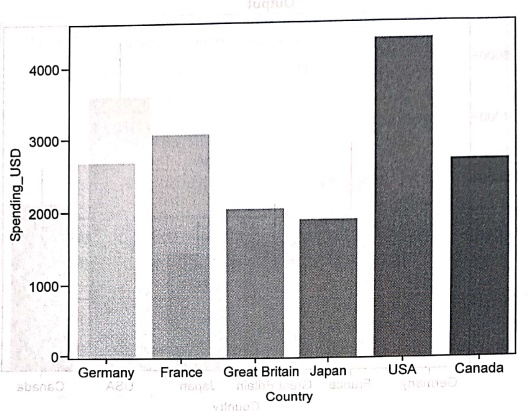
In the above output, the thin vertical
line represents the error bar. We can remove this error bar if we pass the
parameter errorbar = None. For example
res =
sns.barplot(x='Country',y='Spending_USD',data = health,errorbar=None)
•
Then the output will be ‒
•
Finally using plt.show() function of Matplotlib the plot will be displayed.
•
Python Seaborn allows the users to
assign colors to the bars. The bar chart below will convert all the bars to
green color.
res = medi
sns.barplot(x='Country',y='Spending_USD", data = health,color='green')
2) Countplot
The
countplot() function in the Python
Seaborn library returns the count of total values for each category using bars.
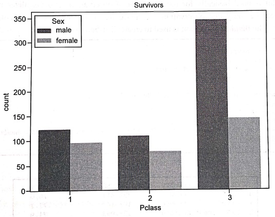
Following plot represents number of males and females survived in the Titanic
boat sink incidence. This data is available in titanic.csv
In [1]:
import numpy as np
import pandas as pd
import matplotlib.pyplot as plt copalbrog?
import seaborn as sns
# read dataset
titanic = pd.read_csv("d:/titanic.csv")
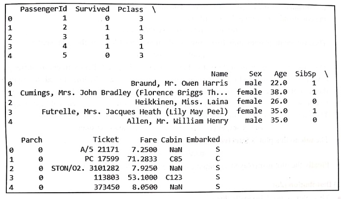
print(titanic.head())
# create plot
sns.countplot(x = 'Pclass',hue='Sex', data = titanic)
plt.title('Survivors')
plt.show()
Output
Code explanation:
In above code
•
Initially we have imported all the
required libraries such as numpy, pandas, matplotlib and seaborn.
•
We have read the csv file named titanic.csv. This file is available on
the internet, it can be downloaded for the purpose of learning data analysis. I
have stored it at the D drive. Hence the command for reading this csv file is ‒
titanic = pd.read_csv("d:/titanic.csv")
•
Then we are displaying only first 5 rows
of the titanic.csv file using the command
print(titanic.head())
•
Then using countplot of seaborn the Pclass data is displayed. Pclass refers
to passenger class (1st, 2nd, 3rd), and is a proxy for socio‒economic class.
The hue is used to visualize the
data of different categories in one plot. Hence the column Sex will be passed as a value to hue so that count of males and females in each class who are
survived will be displayed. The data is in the object titanic. Hence we write the code as ‒
sns.countplot(x =
'Pclass', hue='sex',data = titanic)
•
The title to this plot is Survivors. For this the code is
plt.title('Survivors')
•
Finally the plot is displayed as output
using the command plt.show()
3) Distribution plot
•
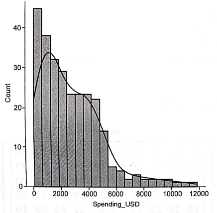
This plot is used basically for univariant set of observations and visualizes
it through a histogram i.e. only one observation and hence we choose one
particular column of the dataset. The displot()
function is used to create distribution of any continuous data.
In [5]:
import numpy as np
import pandas as pd
import matplotlib.pyplot as plt.
import seaborn as sns
#read dataset
health = pd.read_csv("d:/healthexp.csv")
#display sample
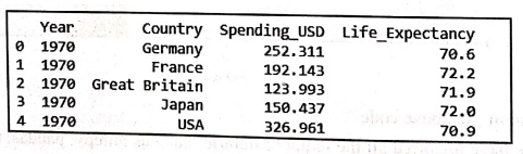
print(health.head())
#create plot
res =sns.displot(x='Spending USD', kde = True, bins = 20, data =
health)
plt.show()
Output
Code explanation:
In above code,
• Initially we have imported all the required
libraries such as numpy, pandas, matplotlib and seaborn.
•
We have read the csv file named healthexp.csv. This file is available
on the internet, it can be downloaded for the purpose of learning data
analysis. I have stored it at the D drive. Hence the command for reading this csv
file is ‒
health =
pd.read_csv("d:/healthexp.csv")
•
Then we are displaying only first 5 rows of the titanic.csv file using the
command
print(health.head())
•
Then using displot of seaborn the Spending
_USD data is displayed. The Spending_USD refers to amount spent by each
country on health. Kernel Density Estimate (KDE) plot is a powerful tool for
estimating the probability density function of continuous or non‒ parametric
data. So the kde = True. bins is
used to set the number of bins you want in your plot and it actually depends on
your dataset. Hence we write the code as –
res
=sns.displot(x='Spending_USD', kde = True, bins = 20, data = health)
•
Finally the plot is displayed as output
using the command plt.show()
4) Heatmap
•
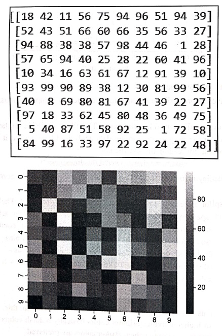
Heatmap allows us to represent the data
in matrix‒like form. In this Heatmap, more common values or higher activities
brighter colors basically reddish colors are used and to represent less common
or activity values, darker colors are preferred.
import numpy as np
import pandas as pd
import matplotlib.pyplot as plt
import seaborn as sns
data1 = np.random.randint(low=1,high=100,size=(10,10))
#display sample
print(data1)
#create plot
res =sns.heatmap(data = data1)
plt.show()
Output
Code explanation:
•
At the beginning of the code, all the
necessary Python library files are imported.
•
Then using the random.randint function the data set is obtained. The random.randint( ) is a NumPy library
function that returns an array of random integers that are discrete uniform
distribution of the specified dtype in the half‒open interval [low, high).
•
The sample is then displayed using print
method.
•
Then using heatmap function and plt.show() function the map is
displayed for this sample data set.
5) Scatterplot
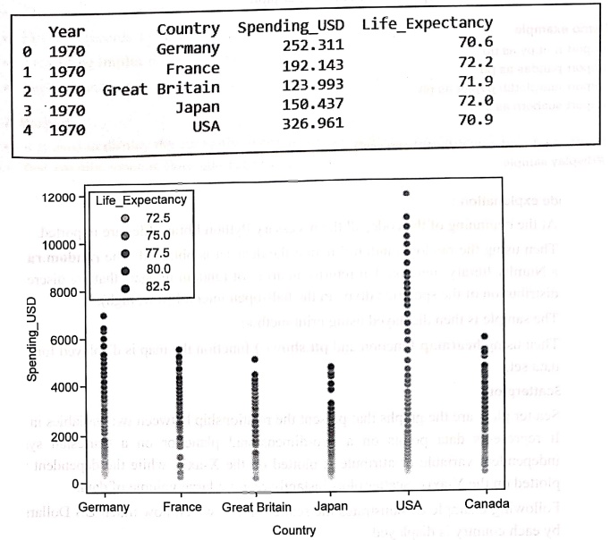
• Scatter plots are the graphs that present the
relationship between two variables in a data‒set. It represents data points on
a two‒dimensional plane or on a Cartesian system. The independent variable or
attribute is plotted on the X‒axis, while the dependent variable is plotted on
the Y‒axis. Scatter plots instantly report a large volume of data.
•
Following example demonstrates the
scatter plot in which how much US Dollars are spent by each country is
displayed.
Demo example
import numpy as np
import pandas as pd
import matplotlib.pyplot as plt
import seaborn as sns
health = pd.read_csv("d:/healthexp.csv")
# Display
sample
print(health.head())
# Create
plot
res=sns.scatterplot(x='Country',y='Spending_USD',hue='Life_Expectancy',data=health)
plt.show()
Output
Code explanation:
In above code,
•
We have imported required library files
such as matplotlib, pandas, numpy and seaborn.
• Then using read_csv function we have read the healthexp.csv file.
•
First five records are displayed on the
console.
•
Then using scatterplot function the
graph is plotted.
• Finally using plt.show() function the graph is displayed as output.
6) Linear regression plot
•
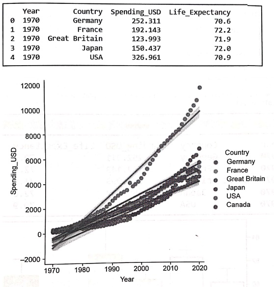
For linear regression plot, the implot
method is used. It draws the scatterplot onto the FacetGrid.
•
Following example demonstrates the year‒wise expenditure in Dollars by each
country. The linear regression line is represented in the scatter plot.
Demo example
import numpy as np
import pandas as pd
import matplotlib.pyplot as plt
import seaborn as sns
health = pd.read_csv("d:/healthexp.csv")
#display sample
print(health.head())
#create plot
res =sns.lmplot(x='Year',y='Spending_USD',hue='Country',
data=health)
plt.show()
Output
Code explanation:
In above code,
• We have imported required library files such
as matplotlib, pandas, numpy and seaborn.
• Then using read_csv function we have read the
healthexp.csv file.
•
First five records are displayed on the
console.
•
Then using implot function the graph is plotted.
•
Finally using plt.show() function the graph is displayed as output.
7) Boxplot
•
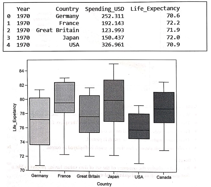
It is used to display the summary of the
set of data values having properties like minimum, first quartile, median,
third quartile and maximum.
• In the box plot, a box is created from the
first quartile to the third quartile, a vertical line is also there which goes
through the box at the median. Here x‒axis denotes the data to be plotted while
the y‒axis shows the frequency distribution.
In [7]:
import numpy as np
import pandas as pd
import matplotlib.pyplot as plt
import seaborn as sns
health = pd.read_csv("d:/healthexp.csv")
#display sample
print(health.head())
#create plot
res sns.boxplot (x='Country',y='Life Expectancy', data=health)
plt.show()
Output
8) Pairplot
•
The pairplot represents the pairwise relationships in a dataset. Pair plot is
used to understand the best set of features to explain a relationship between
two variables or to form the most separated clusters.
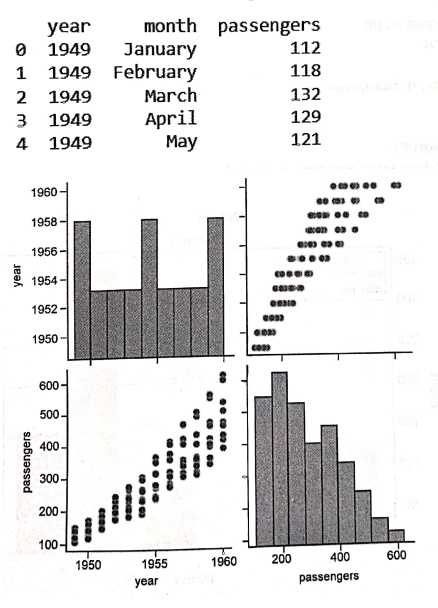
Example code
import numpy as np
import pandas as pd
import matplotlib.pyplot as plt
import seaborn as sns
%matplotlib inline
flights = pd.read_csv("d:/flights.csv")
print(flights.head())
res = sns.pairplot(flights)
plt.show()
Output
•
As you can see, the above output clearly
compares between the year and the number of passengers in different ways.
Python for Data Science: Chapter 6: Data Visualization : Tag: Computer Programming, Python, Data Science : Python data visualization library - Seaborn: Making Sense of Data through Advanced Visualization
Python for Data Science: Chapter 6: Data Visualization
Under Subject
Python for Data Science
AD25201 2nd Semester AIDS Dept | 2025 Regulation | 2nd Semester 2025 Regulation
Related Subjects

English Essentials II
EN25C02 2nd Semester | 2025 Regulation | 2nd Semester 2025 Regulation

Tamils and Technology தமிழர்களும் தொழில்நுட்பமும்
UC25H02 2nd Semester | 2025 Regulation | 2nd Semester 2025 Regulation

Linear Algebra
MA25C02 2nd Semester | 2025 Regulation

Applied Physics (CSIE) II
PH25C03 2nd Semester AIDS, CSE, IT, CSE(CY) Dept | 2025 Regulation | 2nd Semester 2025 Regulation

Digital Principles and Computer Organization
CS25C06 2nd Semester AIDS, CSE, IT, CSE(CY) Dept | 2025 Regulation | 2nd Semester 2025 Regulation

Basic Electrical and Electronics Engineering
EE25C01 2nd Semester | 2025 Regulation | 2nd Semester 2025 Regulation
Python for Data Science
AD25201 2nd Semester AIDS Dept | 2025 Regulation | 2nd Semester 2025 Regulation

Re-Engineering for Innovation
ME25C05 2nd Semester | 2025 Regulation | 2nd Semester 2025 Regulation
Python for Data Science - Laboratory
AD25201 2nd Semester AIDS Dept | 2025 Regulation | 2nd Semester 2025 Regulation