Python for Data Science: Chapter 6: Data Visualization
Matplotlib: Annotations and Drawing on Subplots
Python open source drawing library
Once the subplots are created, we can annotate the text or draw horizontal or vertical lines on each subplot.
Annotations
and Drawing on Subplots
•
Once the subplots are created, we can
annotate the text or draw horizontal or vertical lines on each subplot.
1) Annotation text
•
We use the annotate() function for
writing the text on the subplot.
Syntax
plt.annotate(text, xy,
xytext, arrowprops)
Where
text:
The annotation text
xy:
Coordinates of the point to annotate (x, y)
xytext:
Position of the annotation text
arrowprops:
Style of arrow connecting text and point
2) Drawing lines and shapes
•
We can draw simple shapes or highlight
regions using following functions.
plt.axhline(y,color,linestyle)
: ‒
Draws horizontal line
plt.axvline(x,color,linestyle) :‒ Draws
vertical line
plt.axhspan(ymin,ymax,color,alpha) :‒ Fills
horizontal region
plt.axvspan(xmin,xmax,color,alpha)
:‒ Fills vertical region
Demo example
• Following is a simple Python programs in
which we are annotating and drawing the lines on the subplots.
Python program
import matplotlib.pyplot as plt
fig, axes = plt.subplots(1,2, figsize=(8,3))
x = [1,2,3,4,5]
y1 = [2,4,6,8,10]
y2 = [1,3,2,5,4]
axes[0].plot(x,y1)
axes[0].set_title("Plot#1")
axes[0].axhline(y=sum(y1)/len(y1), linestyle="‒‒") #
average line
axes[0].annotate("Peak", xy=(5,10), xytext=(4,9),
arrowprops= dict(arrowstyle="‒>"))
axes[1].plot(x,y2)
axes[1].set_title("Plot#2")
axes[1].axvspan(3,5, alpha=0.12) # highlight x range
axes[1].text(3.2, 2.5, "busy period")
fig.suptitle("Subplots with Annotations &
Drawings")
plt.tight_layout()
plt.show()
Output
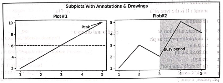
Code explanation:
In above code,
1)
We have created two subplots with titles Plot#1 and Plot#2.
For Plot 1
2) axes[0].axhline(y=sum(y1)/len(y1),
linestyle‒'‒‒'): This draws the horizontal dashed line
at the average value of y1.
3)
axes[0].annotate("Peak", xy=(5,10), xytext=(4,9), arrowprops‒dict(arrowstyle
="‒>")) : This adds an annotation labeled
"Peak" pointing to the highest point (5, 10) with an arrow from (4,
9).
For Plot 2
4)axes[1].axvspan(3, 5,
alpha=0.12): Highlights the x‒range from 3 to 5 with
a translucent vertical band.
5) axes[1].text(3.2,
2.5, "busy period"): Adds a text label
"busy period" inside the highlighted region.
For entire plot
6) fig.suptitle("Subplots
with Annotations & Drawings"): Adds the super
title for the entire plot.
7) plt.tight_layout():
Adjusts spacing between subplots to prevent overlap.
Finally
the complete plot is displayed.
Python for Data Science: Chapter 6: Data Visualization : Tag: Computer Programming, Python, Data Science : Python open source drawing library - Matplotlib: Annotations and Drawing on Subplots
Python for Data Science: Chapter 6: Data Visualization
Under Subject
Python for Data Science
AD25201 2nd Semester AIDS Dept | 2025 Regulation | 2nd Semester 2025 Regulation
Related Subjects

English Essentials II
EN25C02 2nd Semester | 2025 Regulation | 2nd Semester 2025 Regulation

Tamils and Technology தமிழர்களும் தொழில்நுட்பமும்
UC25H02 2nd Semester | 2025 Regulation | 2nd Semester 2025 Regulation
Linear Algebra
MA25C02 2nd Semester | 2025 Regulation

Applied Physics (CSIE) II
PH25C03 2nd Semester AIDS, CSE, IT, CSE(CY) Dept | 2025 Regulation | 2nd Semester 2025 Regulation

Digital Principles and Computer Organization
CS25C06 2nd Semester AIDS, CSE, IT, CSE(CY) Dept | 2025 Regulation | 2nd Semester 2025 Regulation

Basic Electrical and Electronics Engineering
EE25C01 2nd Semester | 2025 Regulation | 2nd Semester 2025 Regulation
Python for Data Science
AD25201 2nd Semester AIDS Dept | 2025 Regulation | 2nd Semester 2025 Regulation

Re-Engineering for Innovation
ME25C05 2nd Semester | 2025 Regulation | 2nd Semester 2025 Regulation
Python for Data Science - Laboratory
AD25201 2nd Semester AIDS Dept | 2025 Regulation | 2nd Semester 2025 Regulation