Python for Data Science: Chapter 6: Data Visualization
Introduction to Matplotlib
Python open source drawing library
Matplotlib is an open source drawing library. We can use it freely.
Chapter:6
Data
Visualization
Introduction
to Matplotlib
•
Matplotlib is an open source drawing
library. We can use it freely.
•
We can generate plots, histograms, bar
charts and other types of charts with few lines of codes.
•
Matplotlib was created by John D.
Hunter.
•
Matplotlib is mostly written in Python and few segments are written in C and
JavaScript.
Features of Matplotlib
1)
It is a powerful tool for data analysis.
2)
It is flexible and support various forms of data representations.
3)
It is easy to access large amount of data using Matplotlib.
4)
It is customizable.
5)
It can run on different platforms.
6)
It is useful in creating advanced visualizations
7)
It is easy to learn and understand.
8)
Being open‒source platform it saves the cost.
Installation
• If a Python
and Pip is already installed on a
system then for installation of Matplotlib following command can be issued at
the command prompt
Prompt> pip install matplotlib
•
If the Python Distribution like Anaconda is already installed on your PC then
the Matplotlib comes by default and there is no need to install it.
Import
•
For using the functionalities offered by the Matplotlib we need to import it
first.
In [1]:
import matplotlib

Matplotlib Pyplot
•
pyplot
is a matplotlib module that provides
simple functions for adding plot elements, such as lines, images, text, etc.
•
Most of the utilities of Matplotlib lie under plyplot submodule and are imported using plt as alias.
•
For using plyplot submodule we write following statement at the beginning of
Python script from matplotlib import plyplot as plt
or
alternatively we can write as
import
matplotlib.pyplot as plt
•
Following example illustrates the use of
plyplot for drawing a line

In [7]: from matplotlib import
pyplot as plt
plt.plot([0,10], [0,100])
plt.show()
Output
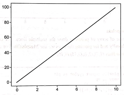
Concept of plot in Matplotlib
•
The plot() function is used to draw
points in a graph. By default plot()
function draws line from point to point.
plt.plot(x‒axis_points,
y‒axis_points)
•
The x‒axis is the horizontal axis and y‒axis is the vertical axis.
Plotting without a line
•
To plot only the markers, we can use shortcut string notation parameter 'o',
which means 'rings'.

In [15]:
from matplotlib import pyplot as plt
plt.plot([0,10], [10, 10], 'o')
plt.show()
Output
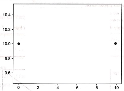
Plot using multiple points
•
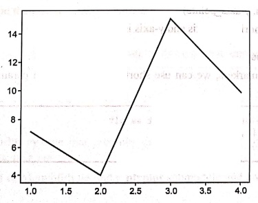
We can make use of array of points to draw the multiple lines. For creating an
array we normally use NumPy and for
plotting the lines we use Matplotlib.
For example ‒
Example:1
Draw
lines (1,7),(2,4), (3,15),(4,10)
Solution:
In [16]:
from matplotlib import pyplot as plt
import numpy as np
x = np.array([1,2,3,4])
y = np.array([7,4,15,10])
plt.plot(x,y)
plt.show()
Output
Python for Data Science: Chapter 6: Data Visualization : Tag: Computer Programming, Python, Data Science : Python open source drawing library - Introduction to Matplotlib
Python for Data Science: Chapter 6: Data Visualization
Under Subject
Python for Data Science
AD25201 2nd Semester AIDS Dept | 2025 Regulation | 2nd Semester 2025 Regulation
Related Subjects

English Essentials II
EN25C02 2nd Semester | 2025 Regulation | 2nd Semester 2025 Regulation

Tamils and Technology தமிழர்களும் தொழில்நுட்பமும்
UC25H02 2nd Semester | 2025 Regulation | 2nd Semester 2025 Regulation
Linear Algebra
MA25C02 2nd Semester | 2025 Regulation

Applied Physics (CSIE) II
PH25C03 2nd Semester AIDS, CSE, IT, CSE(CY) Dept | 2025 Regulation | 2nd Semester 2025 Regulation

Digital Principles and Computer Organization
CS25C06 2nd Semester AIDS, CSE, IT, CSE(CY) Dept | 2025 Regulation | 2nd Semester 2025 Regulation

Basic Electrical and Electronics Engineering
EE25C01 2nd Semester | 2025 Regulation | 2nd Semester 2025 Regulation
Python for Data Science
AD25201 2nd Semester AIDS Dept | 2025 Regulation | 2nd Semester 2025 Regulation

Re-Engineering for Innovation
ME25C05 2nd Semester | 2025 Regulation | 2nd Semester 2025 Regulation
Python for Data Science - Laboratory
AD25201 2nd Semester AIDS Dept | 2025 Regulation | 2nd Semester 2025 Regulation