Python for Data Science: Chapter 6: Data Visualization
Matplotlib: Legends
Python open source drawing library
A legend in Python (using matplotlib) is a box that provides a description of different elements in a plot, helping users understand what each color, line, or marker represents.
Legends
•
A legend in Python (using matplotlib) is a box that provides a description of
different elements in a plot, helping users understand what each color, line, or
marker represents.
Uses of legends
1.
Legends are used to identify multiple data series in the same plot.
2.It
helps to identify different categories, trends or variables.
3.
Legends make the plot more informative and readable.
4.Legends
offer context and explanations for the data being presented, helping viewers
make sense of the information.
5.
By labeling different data series or categories, legends make it easier to
compare and contrast various aspects of the plot.
How to add legends ?
•
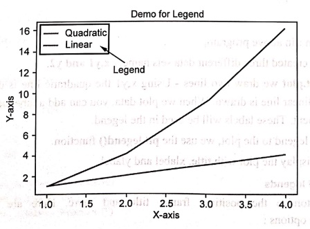
In matplotlib, we use plt.legend() to add a legend to a plot. It can be
represented in a box as shown by following screenshot.
Demo example
import matplotlib.pyplot as plt
x = [1, 2, 3, 4]
y1 = [1, 4, 9, 16]
y2 = [1, 2, 3, 4]
plt.plot(x,y1,label='Quadratic')
plt.plot(x,y2, label='Linear")
plt.legend()
plt.title('Demo for Legend')
plt.xlabel('X‒axis')
plt.ylabel('Y‒axis')
plt.show()
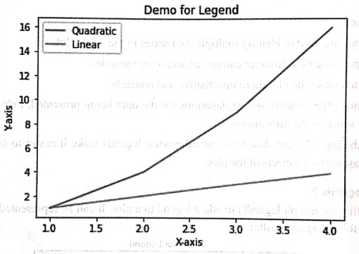
Output
Code explanation:
In above program,
1.We
have created three different data sets namely x,y1 and y2.
2.
Using plt.plot we draw two lines ‒
Using x,y1 the quadratic line is drawn and using x,y2 the linear line is drawn.
When we plot data, you can add a label parameter to each plot element. These
labels will be used in the legend.
3.To
add a legend to the plot, we use the plt.legend()
function.
4.
Finally display the plot with title, xlabel and ylabel.
Customization of legends
•
We can customize the position, frame, title and more. Here are some common customization
options:
1) Positioning:
We can position the legend in various locations using the loc parameter.
Some
common positions include:
• upper right
•
upper left
•
lower right
•
lower left
For
example ‒ plt.legend(loc='upper right')
2) Adding title:
We can add title to legend using the parameter title. For example plt.legend(title="Types of Items')
3) Changing font size:
We can define the font sizes as small, medium or large using legend. The
parameter fontsize is used for this
purpose. You can also use specific numeric values to set the font size in
points. For example ‒
plt.legend(fontsize='medium')
or
plt.legend(fontsize=12)
# Font size in points
4) Shadow:
With shadow=True, we can add a
shadow effect.
Example:1
In the
competitive business world, tracking sales trends over time is crucial for
making informed decisions. Companies analyze sales data to identify which
products perform well and to strategize future marketing efforts.
Write a
Python code to plot the sales of three products in the four months. Make use of
following data. And to distinguish each product sale make use of legend in your
program.
months =
['Jan', 'Feb', 'Mar', 'Apr']
sales_a =
[10, 15, 20, 25]
sales_b =
[5, 10, 15, 20]
sales c=
[7, 14, 21, 28]
Solution:
import matplotlib.pyplot as plt
months = ['Jan', 'Feb', 'Mar', 'Apr']
sales a = [10, 15, 20, 25]
sales_b = [5, 10, 15, 20]
sales_c = [7, 14, 21, 28]
plt.plot(months, sales_a, label='Product A')
plt.plot(months, sales_b, label='Product B')
plt.plot(months, sales_c, label='Product C')
plt.legend(title='Products',
loc='upper left')
plt.title('Monthly Sales Data')
plt.xlabel('Month')
plt.ylabel('Sales')
plt.show()
Output

Example:2
Educational
institutions often analyze student performance to identify trends and improve
teaching strategies. One important aspect of this analysis is understanding how
students of different genders perform in academics across different age groups.
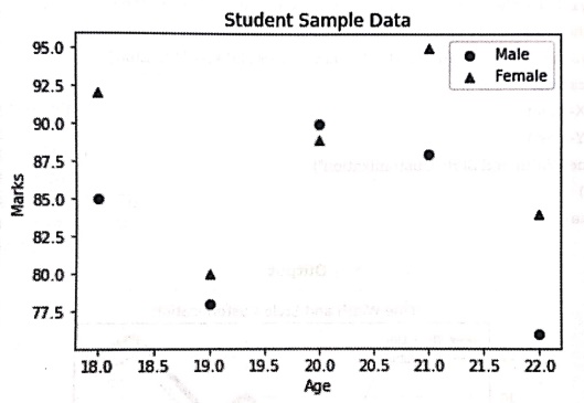
Take hypothetical sample data of students' ages and marks for both males and
females. Write a Python program Represent the data using a scatter plot where:
(a) Male
students are marked with blue circles (0).
(b)
Female students are marked with red triangles (^).
(c) Add a
legend to indicate gender categories.
Solution :
import matplotlib.pyplot as plt
# Sample data (Age vs. Marks)
male_ages = [18, 19, 20, 21, 22]
male_marks = [85, 78, 90, 88, 76]
female_ages = [18, 19, 20, 21, 22]
female_marks = [92, 80, 89, 95, 84]
# Scatter plot
plt.scatter(male_ages, male_marks, color='blue', marker='o',
label="Male") plt.scatter(female_ages, female_marks, color='red',
marker='^', label="Female")
plt.xlabel("Age")
plt.ylabel("Marks")
plt.title("Student Sample Data")
plt.legend()
plt.show()
Output
Python for Data Science: Chapter 6: Data Visualization : Tag: Computer Programming, Python, Data Science : Python open source drawing library - Matplotlib: Legends
Python for Data Science: Chapter 6: Data Visualization
Under Subject
Python for Data Science
AD25201 2nd Semester AIDS Dept | 2025 Regulation | 2nd Semester 2025 Regulation
Related Subjects

English Essentials II
EN25C02 2nd Semester | 2025 Regulation | 2nd Semester 2025 Regulation

Tamils and Technology தமிழர்களும் தொழில்நுட்பமும்
UC25H02 2nd Semester | 2025 Regulation | 2nd Semester 2025 Regulation

Linear Algebra
MA25C02 2nd Semester | 2025 Regulation

Applied Physics (CSIE) II
PH25C03 2nd Semester AIDS, CSE, IT, CSE(CY) Dept | 2025 Regulation | 2nd Semester 2025 Regulation

Digital Principles and Computer Organization
CS25C06 2nd Semester AIDS, CSE, IT, CSE(CY) Dept | 2025 Regulation | 2nd Semester 2025 Regulation

Basic Electrical and Electronics Engineering
EE25C01 2nd Semester | 2025 Regulation | 2nd Semester 2025 Regulation
Python for Data Science
AD25201 2nd Semester AIDS Dept | 2025 Regulation | 2nd Semester 2025 Regulation

Re-Engineering for Innovation
ME25C05 2nd Semester | 2025 Regulation | 2nd Semester 2025 Regulation
Python for Data Science - Laboratory
AD25201 2nd Semester AIDS Dept | 2025 Regulation | 2nd Semester 2025 Regulation