Python for Data Science: Chapter 6: Data Visualization
Matplotlib: Controlling Axes
Python open source drawing library
Controlling Axes: 1. Setting Axis Limits 2. Titles and Labels 3. Ticks
Controlling
Axes
•
When we create a plot using Matplotlib,
the axes (the X‒axis and Y‒axis) define the scale, limits and layout of our
graph.
•
Controlling Axes helps us‒
i)
To focus on specific data ranges.
ii)
Improves readability.
iii)
Highlight important trends.
1. Setting Axis Limits
•
We can set the limits of X‒axis and Y‒axis.
Syntax
plt.xlim(xmin,xmax)
plt.ylim(ymin,ymax)
•
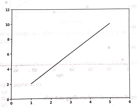
Following is a simple Python program
that illustrates how to set limits to both the x‒axis and y‒axis.
Python
program
import matplotlib.pyplot as plt
x = [1,2,3,4,5]
y = [2,4,6,8,10]
plt.plot(x,y)
plt.xlim(0,6)
plt.ylim(0,12)
plt.show()
Output
2. Titles and Labels
•
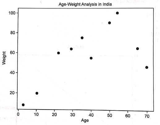
We can give the labels to x‒axis and y‒axis. For that purpose we use the
functions xlabel(label_name) and ylabel(label_name). Similarly the title
to the graph can be given using the function title(title_name)
•
For example ‒
In [11]:
from matplotlib import
pyplot as plt
import numpy as np
age = np.array([10,22,35,50,40,3,65,54,29,70])
weight = np.array([20,60,75,90,55,8,65,100,64,46])
plt.scatter(age, weight)
plt.title("Age‒Weight Analysis in India")
plt.xlabel("Age")
plt.ylabel("weight")
plt.show()
Output
3. Ticks
•
Ticks are the small marks and numbers along each axis.
Syntax
plt.xticks([list of
tick values])
plt.yticks([list of
tick values])
Python
program
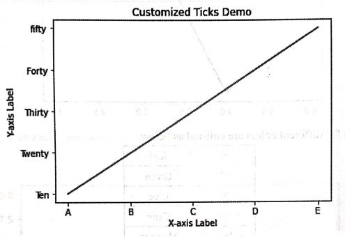
import matplotlib.pyplot as plt
x = [1, 2, 3, 4, 5]
y = [10, 20,30, 40,50]
plt.plot(x, y, label='Sample Line')
plt.xticks([1,
2, 3, 4, 5], ['A', 'B', 'C', 'D', 'E'],color='red')
plt.yticks([10,
20, 30, 40, 50], ['Ten', 'Twenty', 'Thirty', 'Forty', 'fifty'])
plt.xlabel('X‒axis Label')
plt.ylabel('Y‒axis Label')
plt.title('Customized Ticks Demo')
plt.show()
Output
•
This code creates a simple line plot with customized x‒tick and y‒tick labels.,
The xticks are red colored ticks.
Python for Data Science: Chapter 6: Data Visualization : Tag: Computer Programming, Python, Data Science : Python open source drawing library - Matplotlib: Controlling Axes
Python for Data Science: Chapter 6: Data Visualization
Under Subject
Python for Data Science
AD25201 2nd Semester AIDS Dept | 2025 Regulation | 2nd Semester 2025 Regulation
Related Subjects

English Essentials II
EN25C02 2nd Semester | 2025 Regulation | 2nd Semester 2025 Regulation
Tamils and Technology தமிழர்களும் தொழில்நுட்பமும்
UC25H02 2nd Semester | 2025 Regulation | 2nd Semester 2025 Regulation
Linear Algebra
MA25C02 2nd Semester | 2025 Regulation

Applied Physics (CSIE) II
PH25C03 2nd Semester AIDS, CSE, IT, CSE(CY) Dept | 2025 Regulation | 2nd Semester 2025 Regulation
Digital Principles and Computer Organization
CS25C06 2nd Semester AIDS, CSE, IT, CSE(CY) Dept | 2025 Regulation | 2nd Semester 2025 Regulation

Basic Electrical and Electronics Engineering
EE25C01 2nd Semester | 2025 Regulation | 2nd Semester 2025 Regulation
Python for Data Science
AD25201 2nd Semester AIDS Dept | 2025 Regulation | 2nd Semester 2025 Regulation

Re-Engineering for Innovation
ME25C05 2nd Semester | 2025 Regulation | 2nd Semester 2025 Regulation
Python for Data Science - Laboratory
AD25201 2nd Semester AIDS Dept | 2025 Regulation | 2nd Semester 2025 Regulation