Python for Data Science: Chapter 6: Data Visualization
Seaborn: Styling Your Plot
Python data visualization library
Styling Your Plot: 1) Built‒in themes 2) Scaling plots 3) Setting the color palette 4) Setting title, X‒axis label and Y‒axis label
Styling
Your Plot
1) Built‒in themes
•
Seaborn has five built‒in themes to
style its plots: darkgrid, whitegrid, dark, white and ticks.
•
The default theme is darkgrid theme for its plots, but we
can change this styling to better suit your presentation needs.
•
To use these themes we pass the name of it to sns.set_style().
Example code
import numpy as np
import pandas as pd
import matplotlib.pyplot as plt
import seaborn as sns
# read dataset
titanic = pd.read_csv("d:/titanic.csv")
print(titanic.head())
# create
plot
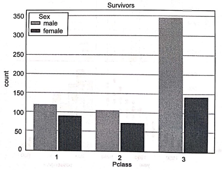
sns.set_style("whitegrid")
sns.countplot(x = 'Pclass',hue='Sex', data = titanic)
plt.title('Survivors')
plt.show()
Output
Survivors
2) Scaling plots
•
For scaling the plots there are four presets which sets the size of the plot
and allows to customize the figure.
•
These size are ‒ paper, notebook, talk,
and poster. The notebook style is the default. We can set the visual format, or
context, using sns.set_context( )
•
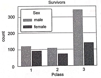
Following code makes use of poster size for scaling plot.
Example code
import numpy as np
import pandas as pd
import matplotlib.pyplot as plt
import seaborn as sns
# read
dataset
titanic = pd.read_csv("d:/titanic.csv")
print(titanic.head())
# create
plot
sns.set_style("whitegrid")
sns.set_context("poster")
sns.countplot(x = 'Pclass',hue='Sex', data = titanic)
plt.title('Survivors')
plt.show()
Output
3) Setting the color palette
•
Using the set_palette() method is
used to set the palette for plots.
Syntax
set_palette(palette,
n_colors=None, desat=None, color_codes=False)
Parameters
• Palette:
The palette that is to be set.
• n_colors:
Number of colors in the cycle.
• Desat:
Proportion to desaturate each color by.
• color_codes:
Takes Booleans values and remaps the shorthand color codes (such as
"b," "g," "r," etc.) to the colours from this
palette if True is passed.
Example code
import numpy as np
import pandas as pd
import matplotlib.pyplot as plt
import seaborn as sns
#read
dataset
titanic = pd.read_csv("d:/titanic.csv")
print(titanic.head())
# create
plot
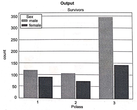
sns.set_context("paper")
sns.set_palette("flare")
sns.countplot(x = 'Pclass',hue='Sex', data = titanic)
plt.title('Survivors')
plt.show()
Output
•
There are various color palettes
available in seaborn. Some commonly used color palette names are ‒ rocket,
mako, flare, crest, viridis, plasma, inferno, magma, cividis.
•
Similarly we can set sequential color
pattern using palette name as Greys, Reds, Greens, Blues, Oranges, Purples,
BuGn, BuPu, GnBu, OrRd, PuBu, PuRd, RdPu, YIGn, PuBuGn, YlGnBu, YlOrBr and
YIOrRd.
4) Setting title, X‒axis label and Y‒axis label
•
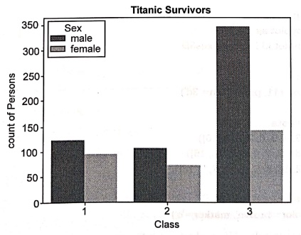
For setting title to the graph the set_title() method is used. Similarly
we can set the labels to the x‒axis and y‒axis using the methods set_xlabel and set_ylabel.
Example code
import numpy as np
import pandas as pd
import matplotlib.pyplot as plt
import seaborn as sns
# read
dataset
titanic = pd.read_csv("d:/titanic.csv")
print(titanic.head())
# create
plot
res=sns.countplot(x = 'Pclass',hue='Sex',data= titanic)
res.set_title("Titanic
Survivors', fontdict={'size': 20, 'weight': 'bold'})
res.set_xlabel('Class',
fontdict={'size': 10})
res.set_ylabel('count
of Persons', fontdict={'size': 10})
plt.show()
Output
Review Questions
1.What is the use of
Seaborn in Python? Enlist the features of it.
2.What is the
difference between Matplotlib and Seaborn?
3.Write short note on ‒
Statistical data visualization.
4. Explain how to plot
in Seaborn with suitable example for sample data set.
5.What is subplot in
Seaborn? Give example.
6.How will you set
title, X‒axis and Y‒axis labels to the plot in Seaborn?
Python for Data Science: Chapter 6: Data Visualization : Tag: Computer Programming, Python, Data Science : Python data visualization library - Seaborn: Styling Your Plot
Python for Data Science: Chapter 6: Data Visualization
Under Subject
Python for Data Science
AD25201 2nd Semester AIDS Dept | 2025 Regulation | 2nd Semester 2025 Regulation
Related Subjects

English Essentials II
EN25C02 2nd Semester | 2025 Regulation | 2nd Semester 2025 Regulation

Tamils and Technology தமிழர்களும் தொழில்நுட்பமும்
UC25H02 2nd Semester | 2025 Regulation | 2nd Semester 2025 Regulation
Linear Algebra
MA25C02 2nd Semester | 2025 Regulation

Applied Physics (CSIE) II
PH25C03 2nd Semester AIDS, CSE, IT, CSE(CY) Dept | 2025 Regulation | 2nd Semester 2025 Regulation
Digital Principles and Computer Organization
CS25C06 2nd Semester AIDS, CSE, IT, CSE(CY) Dept | 2025 Regulation | 2nd Semester 2025 Regulation

Basic Electrical and Electronics Engineering
EE25C01 2nd Semester | 2025 Regulation | 2nd Semester 2025 Regulation
Python for Data Science
AD25201 2nd Semester AIDS Dept | 2025 Regulation | 2nd Semester 2025 Regulation

Re-Engineering for Innovation
ME25C05 2nd Semester | 2025 Regulation | 2nd Semester 2025 Regulation
Python for Data Science - Laboratory
AD25201 2nd Semester AIDS Dept | 2025 Regulation | 2nd Semester 2025 Regulation